70% of Orders Ship within 3 Business Days.
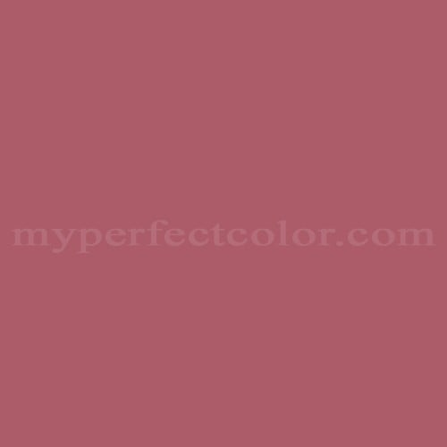
Pantone™ PMS 187 U
Actual color may vary from on-screen representation. Please view a physical color swatch or material sample to confirm your color choice prior to purchase.
Copy below code in your post

Ready to purchase? Select your options in the 4 steps below.
PMS 187 U is a Pantone PMS color specified within the Pantone Matching System and commonly referenced in brand and marketing environments. It conveys a bold, serious, saturated red character with a grounded and authoritative visual presence.
The color appears dark-to-mid in value with an LRV of 17.3 and reads as warm, leaning toward a crimson red rather than orange. It shows high saturation with a subtle blue undertone that deepens its appearance and contributes to its strong visual weight.
PMS 187 U works well in brand-facing displays, signage, and fabricated elements where a deep red needs to maintain presence under varied lighting. Its saturation and depth mean coverage can benefit from careful surface preparation and sufficient coats, particularly over light or uneven substrates, and higher sheens can increase perceived intensity.
Similar colors: PMS 186 U: slightly brighter and more open, with increased red clarity.PMS 188 U: darker and heavier, with a more subdued red presence.
PMS 1807 U: deeper and cooler, with a more restrained, muted character.
Product Data
About Pantone and MyPerfectColor
MyPerfectColor is the official licensee of Pantone and authorized to reproduce the Pantone™ PMS 187 U color in spray paint and other paints.
MyPerfectColor helps marketing professionals turn graphic designs into physical reality. Whether you are a manufacturer, entrepreneur, industrial designer, prototyper/modeler, marketer, agency, printer, retailer, sign manufacturer, exhibit fabricator or architect, MyPerfectColor will help you nail the PMS 187 U color and produce outstanding results.
MyPerfectColor matches the Pantone PMS 187 U color based on Pantone color publications. The PMS 187 U color shown on this website are computer video simulations of the PANTONE PMS 187 U Color and may not match PANTONE®-identified Color standards. Refer to current PANTONE Publications to obtain accurate color.
The Pantone PMS 187 U color may vary from the PANTONE Color Standards based on lighting conditions, angle of view and/or due to differences in pigments, manufacturing process, substrate and/or limitations in the color capability of the paint. Refer to current PANTONE Publications to obtain accurate color.
PANTONE® and other Pantone trademarks are the property of Pantone LLC. Portions © Pantone LLC, 2019. Produced under License Agreement between MyPerfectColor.com and Pantone LLC.

Frequently Asked Questions About Pantone™ PMS 187 U
How should PMS 187 U be evaluated before using it in a retail pop-up or brand installation?
PMS 187 U is a Pantone color standard, not a finished paint specification, so visual evaluation is important before full installation. For retail pop-ups and branded environments, start by ordering a sample in the same paint type and finish you plan to use. View the sample under the actual lighting conditions of the space, including daytime and installed artificial lighting.
Lighting type, surface size, and sheen can all change how PMS 187 U is perceived. Sampling helps confirm that the color meets brand expectations before committing to large panels, walls, or display elements.
What should I consider when applying PMS 187 U over large areas to keep the color uniform?
PMS 187 U is a saturated Pantone color, which means uniform coverage depends heavily on application consistency. Plan for even spray passes or brush technique, maintain consistent overlap, and apply the same number of coats across the entire surface.
Highly saturated colors like PMS 187 U may require additional coats to avoid patchiness, especially on large, continuous areas. Testing coverage on a sample panel helps you determine coat count and application approach before full-scale work.
What safety and VOC expectations should I have when using paint matched to PMS 187 U?
Safety and VOC characteristics are determined by the specific paint product chosen, not by the PMS 187 U color itself. Always review the Safety Data Sheet for the exact paint or spray paint format you are ordering.
Follow all handling, ventilation, and personal protection guidance provided by the manufacturer. This is especially important for indoor brand installations, pop-ups, or enclosed fabrication spaces.
How do I choose the right paint type for using PMS 187 U indoors versus outdoors?
PMS 187 U can be matched into different paint types, but the correct choice depends on where it will be used. For interior brand environments, displays, or exhibits, select a paint designed for indoor use and the expected wear level.
For exterior signage or installations exposed to weather, choose an exterior-rated paint that meets durability and exposure requirements. The Pantone code defines the color target, while the paint type determines performance.
How quickly will I receive my paint matched to Pantone PMS 187 U?
All paint is custom-made to order. While most orders ship within 48 hours, the lead-time for paint made to match Pantone PMS 187 U depends on the type of paint needed. Interior and exterior house paints usually ship within 1 to 3 business days, while custom spray paint typically takes 3-5 business days to ship. The transit time depends on your location and the shipping method you choose. If your need is immediate, select Expedited Production during checkout. Most expedited production orders ship within 24 hours on business days. Please contact MyPerfectColor if you are concerned about a specific deadline. We do our best to make sure you get your paint on time. Learn more about paint lead times at MyPerfectColor.
Can I use the Pantone PMS 187 U for touch up?
Unfortunately, no.
Some manufacturers specify Pantone colors as touch up for their products, but Pantone does not work well as a proxy for a touch-up solution (for a litany of reasons such as it doesn't include sheen and Pantone color tolerances are not tight enough for touch up). When we match Pantone colors we are matching to a swatch in a Pantone book - not to your product.
The only way we can provide a touch-up solution for your product is for you send us a part. We would use the part to create a touch-up grade match. Unfortunately, there isn't an effective way to 'spec' the color well enough to produce a touch up without the part.
Read more about using Pantone for touch-up.
Learn more about our paint color matching service.
How do I buy paint in the Pantone PMS 187 U?
Many types of paint are available for Pantone PMS 187 U with no minimum order quantities. MyPerfectColor offers spray paint, paint pens, touch up bottles, water-based acrylics, epoxies, urethanes and a variety of other paints. Select the Paint Type button above to get started. Learn more about buying paint at MyPerfectColor.
How much area will one spray can cover? And what is Pantone PMS 187 U spray paint made of?
To make spray paint matched to Pantone PMS 187 U. MyPerfectColor uses an acrylic enamel which is a fast-drying durable coating suitable for interior or exterior use. MyPerfectColor custom spray paint enables you to conveniently achieve a professional spray-smooth finish in any color in any sheen. It sticks well to most surfaces including metal, plastics, powder-coatings, cabinets and primed or previously painted wood.
The 11oz spray will cover about 20 square feet per coat. Keep in mind that it is difficult to gauge how much spray you'll need as it is highly dependent on how it is applied. It is better to have too much than run short.
How do I get the SDS (Safety Data Sheet) for paint matched to Pantone PMS 187 U?
The Pantone PMS 187 U is the color and the SDS is based on the type of paint used to make the color. You can find Safety Data Sheets here for our most popular products.
Do I need a primer for Pantone PMS 187 U?
The need for primer for Pantone PMS 187 U depends on the type of paint, the substrate being painted and where it will be located. See our Primer Selection Table to see what primer you might need and learn more about when you might need a primer. Most people don't use a primer for a touch up paint application, but a primer may improve adhesion and is typically recommended for exterior applications.
How do I convert PMS 187 U to a different color from another paint company?
While MyPerfectColor can provide PMS 187 U in paint, we don't provide any crossover information. We've found that every paint company offers its own unique selection of colors and rarely does a color have an exact equivalent in another company's color collection, especially for a color collection like Pantone which is designed for bright colors and inks.
Color details

LRV: 15.93%
Color properties
Color Type:
Standard
Hide:
Standard
Match Source:
Brochure/swatch book
Match Type:
Physical match
Textured:
No
Source on hand:
Yes
Color Category:
Standard