70% of Orders Ship within 3 Business Days.
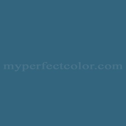
Pantone™ PMS 7699 C
Actual color may vary from on-screen representation. Please view a physical color swatch or material sample to confirm your color choice prior to purchase.
Copy below code in your post

Ready to purchase? Select your options in the 4 steps below.
PMS 7699 C is a standardized color in the Pantone PMS system, positioned within the blue family. The color is perceived as modern, vivid, professional, technical, and assertive, with a noticeably cool cast. Used primarily for brand control and product design, its distinctiveness and clarity support high-visibility applications.
PMS 7699 C appears as a dark blue. The color is distinctly cool in temperature. It displays medium-to-high chroma, resulting in strong saturation. The undertone is primarily blue without evident green or red influence. The finish and sheen can noticeably affect depth and apparent saturation.
PMS 7699 C works well when a bold, contemporary blue is required to establish a confident identity in signage, displays, or branded environments. Optical effects can vary depending on finish; gloss amplifies vibrancy while matte may mute saturation. It responds strongly to lighting conditions—cool lighting will reinforce its crisp quality, while warm lighting can dull the coolness. When evaluating or specifying, compare against adjacent Pantone blues to ensure the level of depth and coolness aligns with requirements.
Similar colors:
- PMS 7700 C: Slightly lighter and less saturated, with a softer overall effect.
- PMS 294 C: Deeper and more neutral, with less chromatic intensity.
- PMS 7687 C: Lighter and more vibrant, appearing closer to a primary blue.
Product Data
About Pantone and MyPerfectColor
MyPerfectColor is the official licensee of Pantone and authorized to reproduce the Pantone™ PMS 7699 C color in spray paint and other paints.
MyPerfectColor helps marketing professionals turn graphic designs into physical reality. Whether you are a manufacturer, entrepreneur, industrial designer, prototyper/modeler, marketer, agency, printer, retailer, sign manufacturer, exhibit fabricator or architect, MyPerfectColor will help you nail the PMS 7699 C color and produce outstanding results.
MyPerfectColor matches the Pantone PMS 7699 C color based on Pantone color publications. The PMS 7699 C color shown on this website are computer video simulations of the PANTONE PMS 7699 C Color and may not match PANTONE®-identified Color standards. Refer to current PANTONE Publications to obtain accurate color.
The Pantone PMS 7699 C color may vary from the PANTONE Color Standards based on lighting conditions, angle of view and/or due to differences in pigments, manufacturing process, substrate and/or limitations in the color capability of the paint. Refer to current PANTONE Publications to obtain accurate color.
PANTONE® and other Pantone trademarks are the property of Pantone LLC. Portions © Pantone LLC, 2019. Produced under License Agreement between MyPerfectColor.com and Pantone LLC.

Frequently Asked Questions About Pantone™ PMS 7699 C
What are best practices for comparing PMS 7699 C samples during a brand approval process?
When evaluating PMS 7699 C for brand approval, always compare samples under consistent lighting that matches the installation environment. Use the same substrate and surface preparation for all samples, as material and finish can influence color appearance. Be sure coatings are fully dried or cured before making final judgments, since PMS 7699 C can shift noticeably in depth and saturation as it sets. Consistency in these variables reduces the risk of approval errors for high-visibility installations.
How should I choose between matte and gloss finishes for PMS 7699 C in a brand display?
For PMS 7699 C, a gloss finish will emphasize color saturation and provide more visual punch, especially from a distance or under strong lighting, but it may create glare. Matte finishes reduce reflection and glare, offering a subtler effect, but may mute the blue's impact and make the color appear deeper or less vibrant. Consider how lighting and viewing angles will affect your project, and test both options when possible before finalizing the specification.
What is the difference between the name PMS 7699 C and its code when ordering paint?
PMS 7699 C refers to a precise Pantone Matching System (PMS) color code, which defines an exact visual target across vendors and substrates. Always specify the full code, including the 'C' for coated, to avoid miscommunication. Ordering only by color name or omitting part of the code could result in receiving the wrong color, since Pantone names may be similar across multiple codes. Use the full PMS 7699 C code for reliable, brand-accurate results.
When is it appropriate to order a standard PMS 7699 C match for paint?
Order a standard PMS 7699 C match if you need consistent brand color for marketing displays, temporary signage, exhibit elements, or prototypes where the Pantone reference is the primary requirement. This approach is best when visual brand alignment is the main goal and the substrate or application is not subject to strict multi-material or lighting-specific approval. For permanent or complex installations, evaluating a sample on the final substrate is recommended.
How quickly will I receive my paint matched to Pantone PMS 7699 C?
All paint is custom-made to order. While most orders ship within 48 hours, the lead-time for paint made to match Pantone PMS 7699 C depends on the type of paint needed. Interior and exterior house paints usually ship within 1 to 3 business days, while custom spray paint typically takes 3-5 business days to ship. The transit time depends on your location and the shipping method you choose. If your need is immediate, select Expedited Production during checkout. Most expedited production orders ship within 24 hours on business days. Please contact MyPerfectColor if you are concerned about a specific deadline. We do our best to make sure you get your paint on time. Learn more about paint lead times at MyPerfectColor.
Can I use the Pantone PMS 7699 C for touch up?
Unfortunately, no.
Some manufacturers specify Pantone colors as touch up for their products, but Pantone does not work well as a proxy for a touch-up solution (for a litany of reasons such as it doesn't include sheen and Pantone color tolerances are not tight enough for touch up). When we match Pantone colors we are matching to a swatch in a Pantone book - not to your product.
The only way we can provide a touch-up solution for your product is for you send us a part. We would use the part to create a touch-up grade match. Unfortunately, there isn't an effective way to 'spec' the color well enough to produce a touch up without the part.
Read more about using Pantone for touch-up.
Learn more about our paint color matching service.
How do I buy paint in the Pantone PMS 7699 C?
Many types of paint are available for Pantone PMS 7699 C with no minimum order quantities. MyPerfectColor offers spray paint, paint pens, touch up bottles, water-based acrylics, epoxies, urethanes and a variety of other paints. Select the Paint Type button above to get started. Learn more about buying paint at MyPerfectColor.
How much area will one spray can cover? And what is Pantone PMS 7699 C spray paint made of?
To make spray paint matched to Pantone PMS 7699 C. MyPerfectColor uses an acrylic enamel which is a fast-drying durable coating suitable for interior or exterior use. MyPerfectColor custom spray paint enables you to conveniently achieve a professional spray-smooth finish in any color in any sheen. It sticks well to most surfaces including metal, plastics, powder-coatings, cabinets and primed or previously painted wood.
The 11oz spray will cover about 20 square feet per coat. Keep in mind that it is difficult to gauge how much spray you'll need as it is highly dependent on how it is applied. It is better to have too much than run short.
How do I get the SDS (Safety Data Sheet) for paint matched to Pantone PMS 7699 C?
The Pantone PMS 7699 C is the color and the SDS is based on the type of paint used to make the color. You can find Safety Data Sheets here for our most popular products.
Do I need a primer for Pantone PMS 7699 C?
The need for primer for Pantone PMS 7699 C depends on the type of paint, the substrate being painted and where it will be located. See our Primer Selection Table to see what primer you might need and learn more about when you might need a primer. Most people don't use a primer for a touch up paint application, but a primer may improve adhesion and is typically recommended for exterior applications.
How do I convert PMS 7699 C to a different color from another paint company?
While MyPerfectColor can provide PMS 7699 C in paint, we don't provide any crossover information. We've found that every paint company offers its own unique selection of colors and rarely does a color have an exact equivalent in another company's color collection, especially for a color collection like Pantone which is designed for bright colors and inks.
Color details

LRV: 13.92%
Color properties
Color Type:
Standard
Hide:
Standard
Match Source:
Brochure/swatch book
Match Type:
Physical match
Textured:
No
Source on hand:
Yes
Color Category:
Standard