70% of Orders Ship within 3 Business Days.
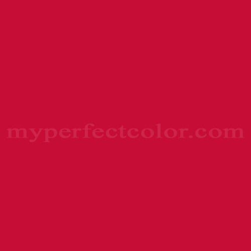
Pantone™ PMS 200 C
Actual color may vary from on-screen representation. Please view a physical color swatch or material sample to confirm your color choice prior to purchase.
Copy below code in your post

Ready to purchase? Select your options in the 4 steps below.
PMS 200 C is part of the Pantone PMS (Pantone Matching System) collection, a standard used for consistent color specification in branding, marketing, and industrial design. This color is recognized for its assertive presence and visual clarity, often described as bold, energetic, and unmistakable. It delivers a commanding impression and is valued for its ability to attract attention and convey a strong, unified brand message.
PMS 200 C is a dark to moderately deep red, with a noticeably low light reflectance value (LRV) of 12.5, resulting in limited lightness. The color carries a warm visual temperature, with a hue that leans toward orange-red but remains decisively red in perception. This color exhibits high saturation, maintaining vividness and intensity across most applications. PMS 200 C is characterized by a pronounced red undertone, with minimal muting or neutral influence. The appearance and perceived depth of PMS 200 C are sensitive to surface finish; higher gloss finishes enhance its vibrancy and depth, while matte can soften its intensity.
PMS 200 C is frequently referenced in branding literature as a specification for collegiate and athletic programs, especially in the United States. The color is often used for major printed materials, signage, and display components in environments prioritizing brand recognition.
PMS 200 C works well when a bold, saturated red is required to convey energy, attention, and assertive branding. Due to its low LRV and high chroma, evaluate coverage expectations, as highly saturated reds may require multiple coats for uniform appearance, especially over lighter or contrasting substrates. Lighting and surface finish choices will significantly influence its final appearance; colors of this intensity may appear deeper under low light or matte finishes, and more vivid under direct or high-gloss conditions. When specifying PMS 200 C for multi-surface applications, pre-application sampling is recommended to assess consistency.
This Pantone PMS color is defined by the Pantone Matching System standard. Evaluate the color using a physical Pantone reference and a real paint sample in the intended lighting and finish. Paint appearance varies by finish and lighting.
- The following examples reflect commonly cited branding associations and are based on publicly referenced design usage; they are illustrative, not exhaustive or exclusive. - PMS 200 C is widely cited as a key color for the University of Alabama’s Crimson Tide athletics and visual identity. - The color is commonly referenced in university branding for Boston University and other academic institutions using deep red in their official palette. - Frequently associated with NCAA and professional sports uniforms, event signage, and branded environments leveraging bold red.
Similar colors:
PMS 201 C is slightly darker and more muted, with a deeper, less saturated red undertone.
PMS 186 C is lighter and more vibrant, providing a more chromatic red appearance.
PMS 187 C is somewhat darker than PMS 200 C, appearing as a rich, deep red with a cooler undertone.
Product Data
About Pantone and MyPerfectColor
MyPerfectColor is the official licensee of Pantone and authorized to reproduce the Pantone™ PMS 200 C color in spray paint and other paints.
MyPerfectColor helps marketing professionals turn graphic designs into physical reality. Whether you are a manufacturer, entrepreneur, industrial designer, prototyper/modeler, marketer, agency, printer, retailer, sign manufacturer, exhibit fabricator or architect, MyPerfectColor will help you nail the PMS 200 C color and produce outstanding results.
MyPerfectColor matches the Pantone PMS 200 C color based on Pantone color publications. The PMS 200 C color shown on this website are computer video simulations of the PANTONE PMS 200 C Color and may not match PANTONE®-identified Color standards. Refer to current PANTONE Publications to obtain accurate color.
The Pantone PMS 200 C color may vary from the PANTONE Color Standards based on lighting conditions, angle of view and/or due to differences in pigments, manufacturing process, substrate and/or limitations in the color capability of the paint. Refer to current PANTONE Publications to obtain accurate color.
PANTONE® and other Pantone trademarks are the property of Pantone LLC. Portions © Pantone LLC, 2019. Produced under License Agreement between MyPerfectColor.com and Pantone LLC.

Frequently Asked Questions About Pantone™ PMS 200 C
What should I consider when using Pantone PMS 200 C for a pop-up or retail environment?
When specifying Pantone PMS 200 C for pop-up shops or retail environments, it is important to assess lighting conditions, desired finish, and the type of surfaces involved. The intense, saturated nature of PMS 200 C means its appearance can shift under different lighting and finish types. Sampling the color on your actual substrate and under the intended lighting is recommended before proceeding with a full installation. This helps ensure that PMS 200 C delivers the correct visual impact and meets brand expectations in real-world conditions. Durability and performance will also depend on the chosen paint format and proper substrate preparation.
How does undercoating affect coverage when painting with PMS 200 C?
PMS 200 C is a deep, highly saturated red that can require multiple coats, especially if applied over a light or contrasting surface. Using an undercoat or primer in a similar or neutral color can improve hide and help achieve a more uniform finish with fewer coats. Planning for additional coats is recommended when working with colors like PMS 200 C to ensure consistent, accurate brand color in marketing or display applications.
What level of durability can I expect from PMS 200 C spray paint for brand installations?
The durability of PMS 200 C spray paint depends on the substrate, surface preparation, and environment. For display and brand experience builds, ensure the surface is clean and properly prepped before application. Using an appropriate topcoat can improve resistance to wear and environmental exposure. Select the paint type according to how much handling, cleaning, or exposure the finished piece will experience. Sampling in your specific setting is recommended to confirm appearance and durability expectations.
Why is sampling PMS 200 C before large builds important for brand approval?
Sampling PMS 200 C on your actual substrate and under real site lighting helps verify that the finished appearance meets brand color requirements. This process supports efficient signoff with marketing or brand teams before committing to large-scale production. It reduces the risk of costly revisions by confirming how PMS 200 C will look in the final environment and finish, ensuring brand consistency across installations.
How quickly will I receive my paint matched to Pantone PMS 200 C?
All paint is custom-made to order. While most orders ship within 48 hours, the lead-time for paint made to match Pantone PMS 200 C depends on the type of paint needed. Interior and exterior house paints usually ship within 1 to 3 business days, while custom spray paint typically takes 3-5 business days to ship. The transit time depends on your location and the shipping method you choose. If your need is immediate, select Expedited Production during checkout. Most expedited production orders ship within 24 hours on business days. Please contact MyPerfectColor if you are concerned about a specific deadline. We do our best to make sure you get your paint on time. Learn more about paint lead times at MyPerfectColor.
Can I use the Pantone PMS 200 C for touch up?
Unfortunately, no.
Some manufacturers specify Pantone colors as touch up for their products, but Pantone does not work well as a proxy for a touch-up solution (for a litany of reasons such as it doesn't include sheen and Pantone color tolerances are not tight enough for touch up). When we match Pantone colors we are matching to a swatch in a Pantone book - not to your product.
The only way we can provide a touch-up solution for your product is for you send us a part. We would use the part to create a touch-up grade match. Unfortunately, there isn't an effective way to 'spec' the color well enough to produce a touch up without the part.
Read more about using Pantone for touch-up.
Learn more about our paint color matching service.
How do I buy paint in the Pantone PMS 200 C?
Many types of paint are available for Pantone PMS 200 C with no minimum order quantities. MyPerfectColor offers spray paint, paint pens, touch up bottles, water-based acrylics, epoxies, urethanes and a variety of other paints. Select the Paint Type button above to get started. Learn more about buying paint at MyPerfectColor.
How much area will one spray can cover? And what is Pantone PMS 200 C spray paint made of?
To make spray paint matched to Pantone PMS 200 C. MyPerfectColor uses an acrylic enamel which is a fast-drying durable coating suitable for interior or exterior use. MyPerfectColor custom spray paint enables you to conveniently achieve a professional spray-smooth finish in any color in any sheen. It sticks well to most surfaces including metal, plastics, powder-coatings, cabinets and primed or previously painted wood.
The 11oz spray will cover about 20 square feet per coat. Keep in mind that it is difficult to gauge how much spray you'll need as it is highly dependent on how it is applied. It is better to have too much than run short.
How do I get the SDS (Safety Data Sheet) for paint matched to Pantone PMS 200 C?
The Pantone PMS 200 C is the color and the SDS is based on the type of paint used to make the color. You can find Safety Data Sheets here for our most popular products.
Do I need a primer for Pantone PMS 200 C?
The need for primer for Pantone PMS 200 C depends on the type of paint, the substrate being painted and where it will be located. See our Primer Selection Table to see what primer you might need and learn more about when you might need a primer. Most people don't use a primer for a touch up paint application, but a primer may improve adhesion and is typically recommended for exterior applications.
How do I convert PMS 200 C to a different color from another paint company?
While MyPerfectColor can provide PMS 200 C in paint, we don't provide any crossover information. We've found that every paint company offers its own unique selection of colors and rarely does a color have an exact equivalent in another company's color collection, especially for a color collection like Pantone which is designed for bright colors and inks.
Color details

LRV: 0.01%
Color properties
Color Type:
Standard
Hide:
Standard
Match Source:
Brochure/swatch book
Match Type:
Physical match
Textured:
No
Source on hand:
Yes
Color Category:
Standard