70% of Orders Ship within 3 Business Days.
Pantone™ PMS 267 U
Actual color may vary from on-screen representation. Please view a physical color swatch or material sample to confirm your color choice prior to purchase.
Copy below code in your post

Ready to purchase? Select your options in the 4 steps below.
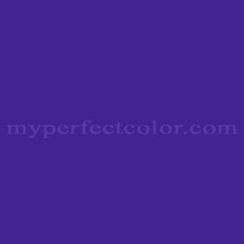
PMS 267 U is a Pantone PMS color specified for brand and marketing contexts where a dark, expressive purple is required. It conveys a cool, modern presence with strong visual weight and is often selected to create contrast in branded environments.
The color appears very dark with a low LRV of 4.42 and a distinctly cool violet-magenta tendency. Its high saturation gives it strong chromatic intensity, while a subtle magenta undertone adds depth beneath the violet body.
PMS 267 U performs well on brand-facing graphics, signage, and exhibit components where visual impact is prioritized. Due to its darkness and saturation, careful surface preparation and consistent application can help achieve even results, and adequate lighting helps prevent the color from reading overly subdued.
Similar colors: PMS 266 U: slightly lighter and more open, with less depth and visual weight.PMS 268 U: darker and cooler, with a more subdued purple character.
PMS 2597 U: brighter and more chromatic, with stronger magenta presence.
Product Data
About Pantone and MyPerfectColor
MyPerfectColor is the official licensee of Pantone and authorized to reproduce the Pantone™ PMS 267 U color in spray paint and other paints.
MyPerfectColor helps marketing professionals turn graphic designs into physical reality. Whether you are a manufacturer, entrepreneur, industrial designer, prototyper/modeler, marketer, agency, printer, retailer, sign manufacturer, exhibit fabricator or architect, MyPerfectColor will help you nail the PMS 267 U color and produce outstanding results.
MyPerfectColor matches the Pantone PMS 267 U color based on Pantone color publications. The PMS 267 U color shown on this website are computer video simulations of the PANTONE PMS 267 U Color and may not match PANTONE®-identified Color standards. Refer to current PANTONE Publications to obtain accurate color.
The Pantone PMS 267 U color may vary from the PANTONE Color Standards based on lighting conditions, angle of view and/or due to differences in pigments, manufacturing process, substrate and/or limitations in the color capability of the paint. Refer to current PANTONE Publications to obtain accurate color.
PANTONE® and other Pantone trademarks are the property of Pantone LLC. Portions © Pantone LLC, 2019. Produced under License Agreement between MyPerfectColor.com and Pantone LLC.

Frequently Asked Questions About Pantone™ PMS 267 U
What does PMS 267 U mean, and why should I order by the full Pantone code instead of just the color name?
PMS 267 U is a specific Pantone Matching System identifier. The number 267 defines the base color, and the U suffix indicates the Uncoated reference standard. Pantone names can be informal or reused across different references, but the full code precisely defines the color target.
When ordering PMS 267 U paint, always include the complete code with the U suffix. Ordering by name alone increases the risk of receiving the wrong reference, such as a coated version or a different Pantone series, which can lead to visible differences in brightness and saturation.
How does sheen affect the appearance of PMS 267 U when choosing a paint finish?
Sheen can significantly change how PMS 267 U is perceived. Higher gloss levels tend to make colors appear darker and more saturated, while flatter finishes can appear lighter or softer under the same lighting.
When selecting a sheen for PMS 267 U, consider viewing distance, substrate, and lighting. If the color will be seen up close or under strong lighting, sheen differences can be more noticeable. For brand-critical applications, it is often best to evaluate a sample in the intended sheen before committing to production.
Why does PMS 267 U look different under various lighting conditions?
PMS 267 U, like many saturated Pantone colors, can shift in appearance depending on the light source. Daylight, LED, fluorescent, and halogen lighting all interact differently with the pigments used to reproduce the Pantone target.
To avoid surprises, evaluate PMS 267 U under the same lighting where it will be displayed or installed. Reviewing a physical sample in real conditions helps confirm that the color meets brand expectations and reduces approval risk.
If I need PMS 267 U to visually blend with an existing painted part, is ordering by Pantone code enough?
Pantone PMS 267 U defines a brand color target, not the exact appearance of an existing painted surface. If your goal is to closely blend with a specific part, ordering only by the Pantone code may not account for substrate, aging, or finish differences.
In situations where close visual blending is required, the most reliable approach is to provide a physical sample for matching. This allows the color to be evaluated directly rather than relying solely on the Pantone reference, which is intended for brand color reproduction rather than part-specific matching.
How quickly will I receive my paint matched to Pantone PMS 267 U?
All paint is custom-made to order. While most orders ship within 48 hours, the lead-time for paint made to match Pantone PMS 267 U depends on the type of paint needed. Interior and exterior house paints usually ship within 1 to 3 business days, while custom spray paint typically takes 3-5 business days to ship. The transit time depends on your location and the shipping method you choose. If your need is immediate, select Expedited Production during checkout. Most expedited production orders ship within 24 hours on business days. Please contact MyPerfectColor if you are concerned about a specific deadline. We do our best to make sure you get your paint on time. Learn more about paint lead times at MyPerfectColor.
Can I use the Pantone PMS 267 U for touch up?
Unfortunately, no.
Some manufacturers specify Pantone colors as touch up for their products, but Pantone does not work well as a proxy for a touch-up solution (for a litany of reasons such as it doesn't include sheen and Pantone color tolerances are not tight enough for touch up). When we match Pantone colors we are matching to a swatch in a Pantone book - not to your product.
The only way we can provide a touch-up solution for your product is for you send us a part. We would use the part to create a touch-up grade match. Unfortunately, there isn't an effective way to 'spec' the color well enough to produce a touch up without the part.
Read more about using Pantone for touch-up.
Learn more about our paint color matching service.
How do I buy paint in the Pantone PMS 267 U?
Many types of paint are available for Pantone PMS 267 U with no minimum order quantities. MyPerfectColor offers spray paint, paint pens, touch up bottles, water-based acrylics, epoxies, urethanes and a variety of other paints. Select the Paint Type button above to get started. Learn more about buying paint at MyPerfectColor.
How much area will one spray can cover? And what is Pantone PMS 267 U spray paint made of?
To make spray paint matched to Pantone PMS 267 U. MyPerfectColor uses an acrylic enamel which is a fast-drying durable coating suitable for interior or exterior use. MyPerfectColor custom spray paint enables you to conveniently achieve a professional spray-smooth finish in any color in any sheen. It sticks well to most surfaces including metal, plastics, powder-coatings, cabinets and primed or previously painted wood.
The 11oz spray will cover about 20 square feet per coat. Keep in mind that it is difficult to gauge how much spray you'll need as it is highly dependent on how it is applied. It is better to have too much than run short.
How do I get the SDS (Safety Data Sheet) for paint matched to Pantone PMS 267 U?
The Pantone PMS 267 U is the color and the SDS is based on the type of paint used to make the color. You can find Safety Data Sheets here for our most popular products.
Do I need a primer for Pantone PMS 267 U?
The need for primer for Pantone PMS 267 U depends on the type of paint, the substrate being painted and where it will be located. See our Primer Selection Table to see what primer you might need and learn more about when you might need a primer. Most people don't use a primer for a touch up paint application, but a primer may improve adhesion and is typically recommended for exterior applications.
How do I convert PMS 267 U to a different color from another paint company?
While MyPerfectColor can provide PMS 267 U in paint, we don't provide any crossover information. We've found that every paint company offers its own unique selection of colors and rarely does a color have an exact equivalent in another company's color collection, especially for a color collection like Pantone which is designed for bright colors and inks.
Color details

LRV: 17.04%
Color properties
Color Type:
Standard
Hide:
Standard
Match Source:
Brochure/swatch book
Match Type:
Physical match
Textured:
No
Source on hand:
Yes
Color Category:
Standard