70% of Orders Ship within 3 Business Days.
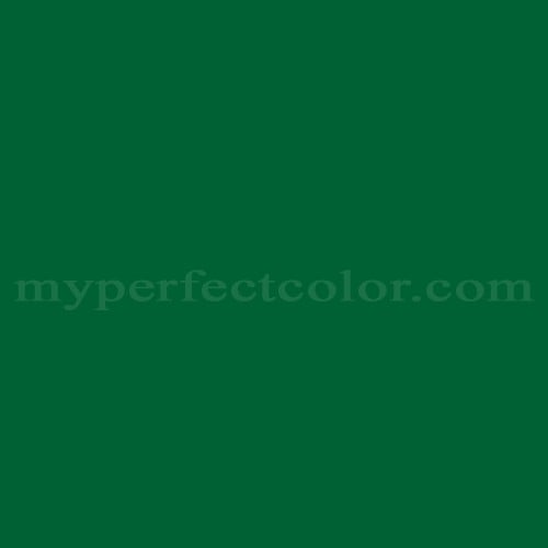
Pantone™ PMS 349 C
Actual color may vary from on-screen representation. Please view a physical color swatch or material sample to confirm your color choice prior to purchase.
Copy below code in your post

Ready to purchase? Select your options in the 4 steps below.
PMS 349 C is a standardized color from the Pantone Matching System, recognized for its distinctive role in visual brand consistency across printed and painted materials. It is described as deep, classic, stable, formal, and technical. The color exhibits a dark value with a strong green hue that is neither overtly yellow nor blue, reflecting a natural-yet-controlled appearance associated with organizations seeking tradition and credibility.
PMS 349 C presents as a dark color, with a measured light reflectance value (LRV) of 8.5. The color has a cool green tendency, without overt yellow or blue shifts. PMS 349 C shows high chroma, contributing to its rich and saturated appearance. The undertone is a controlled, neutral green—neither strongly yellow nor blue—supporting broad applicability on various substrates. The color’s perceived saturation and depth can shift notably depending on finish; gloss finishes intensify chroma, while matte reduces saturation slightly.
PMS 349 C is often specified for official uniforms, signage, and branded equipment in environments requiring a steadfast, institutional green.
PMS 349 C is best used when a reliably dark, saturated green is needed to convey tradition or formality—such as on institutional displays or branded elements. For visually accurate use, evaluate the color under the final lighting and finish, as its depth and saturation may appear differently across sheens. Good surface preparation is essential for even coverage, as darker greens can emphasize substrate imperfections. Compared to similar dark greens, PMS 349 C holds a balanced green hue without noticeable yellow or blue bias, maintaining color stability across materials.
This Pantone PMS color is defined by the Pantone Matching System standard. Evaluate the color using a physical Pantone reference and a real paint sample in the intended lighting and finish. Paint appearance varies by finish and lighting.
- The following examples reflect commonly cited branding associations and are based on publicly referenced design usage; they are illustrative, not exhaustive or exclusive. - PMS 349 C is widely cited as the primary green in the branding of Michigan State University. - The color is commonly referenced in branding literature as a standard institutional green for sporting and academic uniforms in the United States. - PMS 349 C is frequently associated with national and state park systems for signage and park identification.
Similar colors:
PMS 3425 C: Slightly lighter and less saturated, with a more open feel in large applications.
PMS 350 C: Darker, presenting a more muted, almost blackened green.
PMS 348 C: Brighter and more vibrant, appearing as a lighter, more chromatic green alternative.
Product Data
About Pantone and MyPerfectColor
MyPerfectColor is the official licensee of Pantone and authorized to reproduce the Pantone™ PMS 349 C color in spray paint and other paints.
MyPerfectColor helps marketing professionals turn graphic designs into physical reality. Whether you are a manufacturer, entrepreneur, industrial designer, prototyper/modeler, marketer, agency, printer, retailer, sign manufacturer, exhibit fabricator or architect, MyPerfectColor will help you nail the PMS 349 C color and produce outstanding results.
MyPerfectColor matches the Pantone PMS 349 C color based on Pantone color publications. The PMS 349 C color shown on this website are computer video simulations of the PANTONE PMS 349 C Color and may not match PANTONE®-identified Color standards. Refer to current PANTONE Publications to obtain accurate color.
The Pantone PMS 349 C color may vary from the PANTONE Color Standards based on lighting conditions, angle of view and/or due to differences in pigments, manufacturing process, substrate and/or limitations in the color capability of the paint. Refer to current PANTONE Publications to obtain accurate color.
PANTONE® and other Pantone trademarks are the property of Pantone LLC. Portions © Pantone LLC, 2019. Produced under License Agreement between MyPerfectColor.com and Pantone LLC.

Frequently Asked Questions About Pantone™ PMS 349 C
What should I know about coverage when using PMS 349 C paint?
PMS 349 C is a dark, saturated green with high chroma. This level of saturation and depth means that achieving even, uniform coverage may require more coats compared to lighter or less intense colors. For best results, plan for at least two coats, especially if applying PMS 349 C over a light or uneven surface. Thorough surface preparation is important, as substrate flaws may show through darker greens. Always evaluate the finish under your intended lighting and conditions.
How can I get help choosing the right paint type or finish for PMS 349 C?
If you are unsure which product, finish, or application type will achieve your target color for PMS 349 C, contact MyPerfectColor with details about your substrate, exposure conditions, and brand requirements. This information helps select the paint format that best matches your use case, whether you need spray paint, brush-in-cap bottles, paint pens, or another solution for branding or display purposes.
What steps help keep color appearance consistent when reordering PMS 349 C paint?
To achieve consistent results on PMS 349 C across multiple orders, use the same paint type and sheen each time, and specify the desired Pantone standard as your visual target. Review samples of new batches under your actual lighting and finish before production. Consistency in substrate and surface preparation will also support uniform appearance for brand and display work.
When is a primer needed for PMS 349 C paint applications?
A primer may be needed with PMS 349 C depending on your substrate, desired finish, and paint type. Primers promote adhesion and improve coverage, especially over bare, glossy, or uneven surfaces. For dark, saturated colors like PMS 349 C, a primer that is close in shade to the final color can help reduce the number of paint coats needed. If you are unsure, contact MyPerfectColor with your project details for guidance on primer selection.
How quickly will I receive my paint matched to Pantone PMS 349 C?
All paint is custom-made to order. While most orders ship within 48 hours, the lead-time for paint made to match Pantone PMS 349 C depends on the type of paint needed. Interior and exterior house paints usually ship within 1 to 3 business days, while custom spray paint typically takes 3-5 business days to ship. The transit time depends on your location and the shipping method you choose. If your need is immediate, select Expedited Production during checkout. Most expedited production orders ship within 24 hours on business days. Please contact MyPerfectColor if you are concerned about a specific deadline. We do our best to make sure you get your paint on time. Learn more about paint lead times at MyPerfectColor.
Can I use the Pantone PMS 349 C for touch up?
Unfortunately, no.
Some manufacturers specify Pantone colors as touch up for their products, but Pantone does not work well as a proxy for a touch-up solution (for a litany of reasons such as it doesn't include sheen and Pantone color tolerances are not tight enough for touch up). When we match Pantone colors we are matching to a swatch in a Pantone book - not to your product.
The only way we can provide a touch-up solution for your product is for you send us a part. We would use the part to create a touch-up grade match. Unfortunately, there isn't an effective way to 'spec' the color well enough to produce a touch up without the part.
Read more about using Pantone for touch-up.
Learn more about our paint color matching service.
How do I buy paint in the Pantone PMS 349 C?
Many types of paint are available for Pantone PMS 349 C with no minimum order quantities. MyPerfectColor offers spray paint, paint pens, touch up bottles, water-based acrylics, epoxies, urethanes and a variety of other paints. Select the Paint Type button above to get started. Learn more about buying paint at MyPerfectColor.
How much area will one spray can cover? And what is Pantone PMS 349 C spray paint made of?
To make spray paint matched to Pantone PMS 349 C. MyPerfectColor uses an acrylic enamel which is a fast-drying durable coating suitable for interior or exterior use. MyPerfectColor custom spray paint enables you to conveniently achieve a professional spray-smooth finish in any color in any sheen. It sticks well to most surfaces including metal, plastics, powder-coatings, cabinets and primed or previously painted wood.
The 11oz spray will cover about 20 square feet per coat. Keep in mind that it is difficult to gauge how much spray you'll need as it is highly dependent on how it is applied. It is better to have too much than run short.
How do I get the SDS (Safety Data Sheet) for paint matched to Pantone PMS 349 C?
The Pantone PMS 349 C is the color and the SDS is based on the type of paint used to make the color. You can find Safety Data Sheets here for our most popular products.
Do I need a primer for Pantone PMS 349 C?
The need for primer for Pantone PMS 349 C depends on the type of paint, the substrate being painted and where it will be located. See our Primer Selection Table to see what primer you might need and learn more about when you might need a primer. Most people don't use a primer for a touch up paint application, but a primer may improve adhesion and is typically recommended for exterior applications.
How do I convert PMS 349 C to a different color from another paint company?
While MyPerfectColor can provide PMS 349 C in paint, we don't provide any crossover information. We've found that every paint company offers its own unique selection of colors and rarely does a color have an exact equivalent in another company's color collection, especially for a color collection like Pantone which is designed for bright colors and inks.
Color details

LRV: 0.01%
Color properties
Color Type:
Standard
Hide:
Standard
Match Source:
Brochure/swatch book
Match Type:
Physical match
Textured:
No
Source on hand:
Yes
Color Category:
Standard