70% of Orders Ship within 3 Business Days.
Pantone™ PMS 296 C
Actual color may vary from on-screen representation. Please view a physical color swatch or material sample to confirm your color choice prior to purchase.
Copy below code in your post

Ready to purchase? Select your options in the 4 steps below.
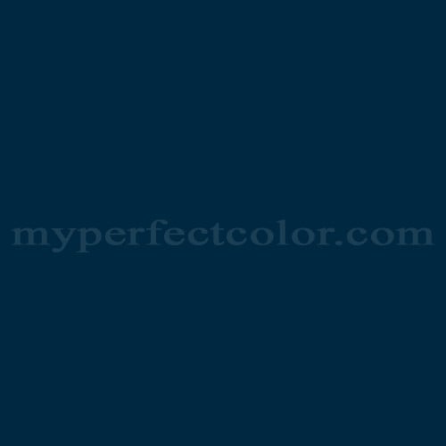
PMS 296 C is a standardized color within the Pantone PMS system, widely used in branding and specification contexts. The color is notably dark and conveys descriptors such as authoritative, technical, professional, refined, and subdued. Its visual appearance provides a sense of stability and formality, making it a frequent choice in environments demanding clear, consistent brand presentation.
PMS 296 C exhibits extremely low light reflectance, with an LRV of 1.73, indicating it is among the darkest blue tones available in the PMS collection. The color has a cool visual temperature, resulting from its pronounced blue composition and blue-green bias. PMS 296 C demonstrates moderate chroma, appearing neither vivid nor muted but firmly saturated for a deep shade. The undertone is decidedly blue with hints of green, which may be perceived more clearly under daylight-balanced or cool lighting. The color is sensitive to gloss level; higher sheens increase reflectivity and may emphasize subtle green undertones or create the perception of a slightly lighter color.
PMS 296 C is often used in corporate identity systems for major educational institutions and global organizations seeking a deep blue that conveys trust and seriousness.
PMS 296 C performs well as a background, accent, or primary brand color where a deep blue with minimal reflectivity is desired. It maintains visual integrity under various lighting conditions but is best evaluated in the intended environment and finish due to its sensitivity to gloss and surrounding colors. Adequate surface preparation is essential to avoid uneven absorption, which is more visible in dark, saturated paints. Compared to other deep blues, PMS 296 C stands out for its subtle green undertone and near-black appearance, making it a reliable option where absolute color consistency and understated impact are priorities.
The following examples reflect commonly cited branding associations and are based on publicly referenced design usage; they are illustrative, not exhaustive or exclusive. PMS 296 C is widely cited as a principal blue in the branding of the U.S. Department of Homeland Security. PMS 296 C is frequently referenced in university identity guidelines, notably in the branding palettes of institutions such as the University of Michigan and other major universities.
Similar colors:
PMS 289 C: Slightly darker and more neutral, resulting in a less saturated blue-black.
PMS 295 C: Lighter and somewhat brighter, producing a slightly less somber and more vivid blue.
PMS 540 C: Noticeably lighter and more saturated, presenting as a truer, clearer blue without green undertone.
Product Data
About Pantone and MyPerfectColor
MyPerfectColor is the official licensee of Pantone and authorized to reproduce the Pantone™ PMS 296 C color in spray paint and other paints.
MyPerfectColor helps marketing professionals turn graphic designs into physical reality. Whether you are a manufacturer, entrepreneur, industrial designer, prototyper/modeler, marketer, agency, printer, retailer, sign manufacturer, exhibit fabricator or architect, MyPerfectColor will help you nail the PMS 296 C color and produce outstanding results.
MyPerfectColor matches the Pantone PMS 296 C color based on Pantone color publications. The PMS 296 C color shown on this website are computer video simulations of the PANTONE PMS 296 C Color and may not match PANTONE®-identified Color standards. Refer to current PANTONE Publications to obtain accurate color.
The Pantone PMS 296 C color may vary from the PANTONE Color Standards based on lighting conditions, angle of view and/or due to differences in pigments, manufacturing process, substrate and/or limitations in the color capability of the paint. Refer to current PANTONE Publications to obtain accurate color.
PANTONE® and other Pantone trademarks are the property of Pantone LLC. Portions © Pantone LLC, 2019. Produced under License Agreement between MyPerfectColor.com and Pantone LLC.

Frequently Asked Questions About Pantone™ PMS 296 C
How do I confirm if PMS 296 C is the exact Pantone code needed for my project?
The correct Pantone color reference for your project may depend on details such as suffixes, series, or finish, for example PMS 296 C. Always review brand guidelines or official documentation to verify that PMS 296 C is the exact code specified for your use. Using the wrong code or omitting a suffix may result in a color mismatch, which can affect brand consistency for your displays, signage, or marketing materials.
What factors affect shipping times for PMS 296 C matched paint orders?
Shipping transit time for PMS 296 C paint orders depends on your location, the delivery address, and the shipping method you select at checkout. Custom mixed Pantone colors like PMS 296 C require production time before shipping. Plan your order with your project schedule in mind to avoid delays, especially for brand launches, event fabrication, or installation deadlines.
What is the best way to evaluate PMS 296 C samples during color approval?
To accurately assess PMS 296 C samples, use consistent lighting (such as daylight-balanced or your project's typical environment), test on the same substrate intended for the final installation, and let the paint fully dry and cure before making a decision. Finish and gloss can change PMS 296 C's appearance, so review the sample in the final finish whenever possible for reliable brand color approval.
How do I select the right paint type for PMS 296 C for interior versus exterior applications?
When specifying PMS 296 C for a project, choose an interior paint for indoor applications and an exterior paint for surfaces exposed to weather or sunlight. Interior paints are designed for controlled environments, while exterior formulations offer protection against the elements to help maintain PMS 296 C's appearance over time. Consider intended use and exposure to ensure the best match for your branding and display needs.
How quickly will I receive my paint matched to Pantone PMS 296 C?
All paint is custom-made to order. While most orders ship within 48 hours, the lead-time for paint made to match Pantone PMS 296 C depends on the type of paint needed. Interior and exterior house paints usually ship within 1 to 3 business days, while custom spray paint typically takes 3-5 business days to ship. The transit time depends on your location and the shipping method you choose. If your need is immediate, select Expedited Production during checkout. Most expedited production orders ship within 24 hours on business days. Please contact MyPerfectColor if you are concerned about a specific deadline. We do our best to make sure you get your paint on time. Learn more about paint lead times at MyPerfectColor.
Can I use the Pantone PMS 296 C for touch up?
Unfortunately, no.
Some manufacturers specify Pantone colors as touch up for their products, but Pantone does not work well as a proxy for a touch-up solution (for a litany of reasons such as it doesn't include sheen and Pantone color tolerances are not tight enough for touch up). When we match Pantone colors we are matching to a swatch in a Pantone book - not to your product.
The only way we can provide a touch-up solution for your product is for you send us a part. We would use the part to create a touch-up grade match. Unfortunately, there isn't an effective way to 'spec' the color well enough to produce a touch up without the part.
Read more about using Pantone for touch-up.
Learn more about our paint color matching service.
How do I buy paint in the Pantone PMS 296 C?
Many types of paint are available for Pantone PMS 296 C with no minimum order quantities. MyPerfectColor offers spray paint, paint pens, touch up bottles, water-based acrylics, epoxies, urethanes and a variety of other paints. Select the Paint Type button above to get started. Learn more about buying paint at MyPerfectColor.
How much area will one spray can cover? And what is Pantone PMS 296 C spray paint made of?
To make spray paint matched to Pantone PMS 296 C. MyPerfectColor uses an acrylic enamel which is a fast-drying durable coating suitable for interior or exterior use. MyPerfectColor custom spray paint enables you to conveniently achieve a professional spray-smooth finish in any color in any sheen. It sticks well to most surfaces including metal, plastics, powder-coatings, cabinets and primed or previously painted wood.
The 11oz spray will cover about 20 square feet per coat. Keep in mind that it is difficult to gauge how much spray you'll need as it is highly dependent on how it is applied. It is better to have too much than run short.
How do I get the SDS (Safety Data Sheet) for paint matched to Pantone PMS 296 C?
The Pantone PMS 296 C is the color and the SDS is based on the type of paint used to make the color. You can find Safety Data Sheets here for our most popular products.
Do I need a primer for Pantone PMS 296 C?
The need for primer for Pantone PMS 296 C depends on the type of paint, the substrate being painted and where it will be located. See our Primer Selection Table to see what primer you might need and learn more about when you might need a primer. Most people don't use a primer for a touch up paint application, but a primer may improve adhesion and is typically recommended for exterior applications.
How do I convert PMS 296 C to a different color from another paint company?
While MyPerfectColor can provide PMS 296 C in paint, we don't provide any crossover information. We've found that every paint company offers its own unique selection of colors and rarely does a color have an exact equivalent in another company's color collection, especially for a color collection like Pantone which is designed for bright colors and inks.
Color details

LRV: 3.77%
Color properties
Color Type:
Standard
Hide:
Standard
Match Source:
Brochure/swatch book
Match Type:
Physical match
Textured:
No
Source on hand:
Yes
Color Category:
Standard