70% of Orders Ship within 3 Business Days.
Pantone™ PMS 179 C
Actual color may vary from on-screen representation. Please view a physical color swatch or material sample to confirm your color choice prior to purchase.
Copy below code in your post

Ready to purchase? Select your options in the 4 steps below.
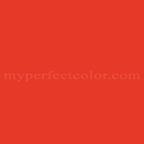
PMS 179 C is a Pantone Matching System (PMS) color recognized for its use in visually prominent brand and display settings. Originating from the Pantone PMS collection, the color offers a vibrant, energetic, and technical appearance with a distinctly warm, assertive, and attention-grabbing vibe. It is commonly selected for its ability to convey urgency and draw focus in both print and painted implementations.
PMS 179 C presents as a moderately dark color, with an LRV of 20.14, producing a strong, saturated presence without being extremely deep. The color trend is notably warm, with a pronounced red-orange hue, indicated by its qualitative hue angle. PMS 179 C is highly saturated, appearing bold and vivid rather than muted or pastel. The undertone leans toward orange, giving it a fiery, dynamic aspect alongside its red base. Finish sensitivity is moderate; higher gloss finishes may enhance perceived chroma and visual intensity, while matte surfaces may reduce saturation.
PMS 179 C is often used in display graphics, signage, and brand elements requiring consistent, high-visibility color reproduction. The color is frequently included in environmental branding specifications for retail, exhibit, and promotional installations.
PMS 179 C works well when a project demands a strong, warm, and attention-commanding red with orange undertones. Users should evaluate this color under actual lighting and finish conditions, as both factors can shift its appearance in intensity and warmth. Due to its high saturation and moderate darkness, substrate preparation is important for uniform coverage; additional coats may be required on high-contrast or porous surfaces. Price and production efficiency can be influenced by the need to achieve uniform appearance, especially when compared to less saturated or cooler reds.
Similar colors:
PMS 485 C – Exhibits a lighter, more chromatic red with less visible orange, resulting in a brighter but less fiery overall look.
PMS 186 C – Is a deeper, cooler red, providing more depth and less orange warmth compared to PMS 179 C.
PMS 172 C – Appears lighter and more orange, feeling warmer and less dominated by red than PMS 179 C.
Product Data
About Pantone and MyPerfectColor
MyPerfectColor is the official licensee of Pantone and authorized to reproduce the Pantone™ PMS 179 C color in spray paint and other paints.
MyPerfectColor helps marketing professionals turn graphic designs into physical reality. Whether you are a manufacturer, entrepreneur, industrial designer, prototyper/modeler, marketer, agency, printer, retailer, sign manufacturer, exhibit fabricator or architect, MyPerfectColor will help you nail the PMS 179 C color and produce outstanding results.
MyPerfectColor matches the Pantone PMS 179 C color based on Pantone color publications. The PMS 179 C color shown on this website are computer video simulations of the PANTONE PMS 179 C Color and may not match PANTONE®-identified Color standards. Refer to current PANTONE Publications to obtain accurate color.
The Pantone PMS 179 C color may vary from the PANTONE Color Standards based on lighting conditions, angle of view and/or due to differences in pigments, manufacturing process, substrate and/or limitations in the color capability of the paint. Refer to current PANTONE Publications to obtain accurate color.
PANTONE® and other Pantone trademarks are the property of Pantone LLC. Portions © Pantone LLC, 2019. Produced under License Agreement between MyPerfectColor.com and Pantone LLC.

Frequently Asked Questions About Pantone™ PMS 179 C
How closely can MyPerfectColor match Pantone PMS 179 C in paint, and what challenges should I expect?
Pantone PMS 179 C is a highly saturated red-orange color, which makes achieving a precise match across different paint types and substrates challenging. MyPerfectColor specializes in matching Pantone colors, but factors like surface material, lighting, and finish will affect the perceived color. While visual alignment is excellent for branding, signage, and display projects, very slight shifts may occur due to paint chemistry and the difference between ink and paint systems. For projects demanding strict visual brand accuracy, always review a sample under actual project conditions and lighting.
What should I know about coverage and hide when using paint matched to PMS 179 C?
Paints matched to PMS 179 C are bold and highly saturated, which means they may require additional coats to achieve full, uniform coverage, especially over high-contrast or porous surfaces. For best results, ensure the substrate is properly prepared and consider using a tinted primer or additional coats to minimize show-through. Coverage can also be affected by the finish and the type of paint selected.
Where can I find the SDS for paint made in Pantone PMS 179 C?
The Safety Data Sheet (SDS) for paint matched to Pantone PMS 179 C is specific to the product type and not the color itself. To access the appropriate SDS, refer to the SDS library and select the paint format and brand you are ordering. Always review the SDS for important safety, handling, and regulatory information before use.
Do I need a primer when applying PMS 179 C matched paint?
Whether a primer is needed for PMS 179 C depends on factors such as the substrate material, paint type, and exposure. A primer is typically recommended for new, uncoated, or porous surfaces to improve adhesion and coverage. For high-contrast surfaces or when consistent color appearance is critical, priming will help achieve uniform results. Consult product-specific primer recommendations or reach out for project-specific guidance if unsure.
How quickly will I receive my paint matched to Pantone PMS 179 C?
All paint is custom-made to order. While most orders ship within 48 hours, the lead-time for paint made to match Pantone PMS 179 C depends on the type of paint needed. Interior and exterior house paints usually ship within 1 to 3 business days, while custom spray paint typically takes 3-5 business days to ship. The transit time depends on your location and the shipping method you choose. If your need is immediate, select Expedited Production during checkout. Most expedited production orders ship within 24 hours on business days. Please contact MyPerfectColor if you are concerned about a specific deadline. We do our best to make sure you get your paint on time. Learn more about paint lead times at MyPerfectColor.
Can I use the Pantone PMS 179 C for touch up?
Unfortunately, no.
Some manufacturers specify Pantone colors as touch up for their products, but Pantone does not work well as a proxy for a touch-up solution (for a litany of reasons such as it doesn't include sheen and Pantone color tolerances are not tight enough for touch up). When we match Pantone colors we are matching to a swatch in a Pantone book - not to your product.
The only way we can provide a touch-up solution for your product is for you send us a part. We would use the part to create a touch-up grade match. Unfortunately, there isn't an effective way to 'spec' the color well enough to produce a touch up without the part.
Read more about using Pantone for touch-up.
Learn more about our paint color matching service.
How do I buy paint in the Pantone PMS 179 C?
Many types of paint are available for Pantone PMS 179 C with no minimum order quantities. MyPerfectColor offers spray paint, paint pens, touch up bottles, water-based acrylics, epoxies, urethanes and a variety of other paints. Select the Paint Type button above to get started. Learn more about buying paint at MyPerfectColor.
How much area will one spray can cover? And what is Pantone PMS 179 C spray paint made of?
To make spray paint matched to Pantone PMS 179 C. MyPerfectColor uses an acrylic enamel which is a fast-drying durable coating suitable for interior or exterior use. MyPerfectColor custom spray paint enables you to conveniently achieve a professional spray-smooth finish in any color in any sheen. It sticks well to most surfaces including metal, plastics, powder-coatings, cabinets and primed or previously painted wood.
The 11oz spray will cover about 20 square feet per coat. Keep in mind that it is difficult to gauge how much spray you'll need as it is highly dependent on how it is applied. It is better to have too much than run short.
How do I get the SDS (Safety Data Sheet) for paint matched to Pantone PMS 179 C?
The Pantone PMS 179 C is the color and the SDS is based on the type of paint used to make the color. You can find Safety Data Sheets here for our most popular products.
Do I need a primer for Pantone PMS 179 C?
The need for primer for Pantone PMS 179 C depends on the type of paint, the substrate being painted and where it will be located. See our Primer Selection Table to see what primer you might need and learn more about when you might need a primer. Most people don't use a primer for a touch up paint application, but a primer may improve adhesion and is typically recommended for exterior applications.
How do I convert PMS 179 C to a different color from another paint company?
While MyPerfectColor can provide PMS 179 C in paint, we don't provide any crossover information. We've found that every paint company offers its own unique selection of colors and rarely does a color have an exact equivalent in another company's color collection, especially for a color collection like Pantone which is designed for bright colors and inks.
Color details

LRV: 19.86%
Color properties
Color Type:
Standard
Hide:
Standard
Match Source:
Brochure/swatch book
Match Type:
Physical match
Textured:
No
Source on hand:
Yes
Color Category:
Standard