70% of Orders Ship within 3 Business Days.
Pantone™ PMS 170 C
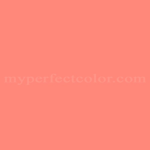
Actual color may vary from on-screen representation. Please view a physical color swatch or material sample to confirm your color choice prior to purchase.
Copy below code in your post

Ready to purchase? Select your options in the 4 steps below.
PMS 170 C is a Pantone Matching System (PMS) color. It presents a balanced, energetic orange with moderately high visibility, often characterized as lively, contemporary, and attention-getting. This color is used in environments where clarity, emphasis, and accessible warmth are required. The visual tendency is assertive but not overly saturated, allowing effective use in both accent and field applications within brand presentation contexts.
PMS 170 C appears as a medium-light orange, with a light reflectance value (LRV) of 42.19, offering moderate brightness. The color shows a warm tendency, with a pronounced orange hue. PMS 170 C exhibits moderate to high saturation, delivering a vivid but not fluorescent impression. The color displays a subtle red undertone, distinguishing it from yellower or more muted oranges. PMS 170 C can be sensitive to finish type: gloss finishes will amplify vibrancy, while matte finishes will temper its visual impact.
PMS 170 C is often used for brand and identity accenting when a lively warm orange is required for signage, displays, packaging, and event materials. The color is specified in exhibition design and marketing installations seeking to attract attention without resorting to primary reds or yellows.
PMS 170 C is effective when visual clarity and warmth are needed to delineate brand spaces or direct attention. It is especially useful in high-visibility areas or for accent elements within a larger composition. When using PMS 170 C in paint, evaluate finish choices carefully to control perceived saturation and lightness. Coverage may require attention due to the moderate LRV and relatively high chroma, especially over contrasting base coats. Comparatively, PMS 170 C is warmer and more chromatic than muted oranges, but less aggressive than true reddish oranges, offering a balanced option for impactful brand presence without overwhelming adjacent elements.
Similar colors:
PMS 165 C – Slightly deeper and redder, resulting in a stronger, more intense visual presence.
PMS 151 C – Lighter and more yellow, appearing brighter and less saturated.
PMS 172 C – Darker and more robust, with a redder overtone compared to PMS 170 C.
Product Data
About Pantone and MyPerfectColor
MyPerfectColor is the official licensee of Pantone and authorized to reproduce the Pantone™ PMS 170 C color in spray paint and other paints.
MyPerfectColor helps marketing professionals turn graphic designs into physical reality. Whether you are a manufacturer, entrepreneur, industrial designer, prototyper/modeler, marketer, agency, printer, retailer, sign manufacturer, exhibit fabricator or architect, MyPerfectColor will help you nail the PMS 170 C color and produce outstanding results.
MyPerfectColor matches the Pantone PMS 170 C color based on Pantone color publications. The PMS 170 C color shown on this website are computer video simulations of the PANTONE PMS 170 C Color and may not match PANTONE®-identified Color standards. Refer to current PANTONE Publications to obtain accurate color.
The Pantone PMS 170 C color may vary from the PANTONE Color Standards based on lighting conditions, angle of view and/or due to differences in pigments, manufacturing process, substrate and/or limitations in the color capability of the paint. Refer to current PANTONE Publications to obtain accurate color.
PANTONE® and other Pantone trademarks are the property of Pantone LLC. Portions © Pantone LLC, 2019. Produced under License Agreement between MyPerfectColor.com and Pantone LLC.

Frequently Asked Questions About Pantone™ PMS 170 C
What should I consider when using Pantone PMS 170 C for pop-up or retail environments?
When using Pantone PMS 170 C in pop-up or retail settings, assess the durability of the paint system for the intended use and schedule. It is important to view PMS 170 C samples under the actual lighting conditions where they will be installed, as color appearance can shift noticeably with different lighting types and intensities. Always order and evaluate a sample of PMS 170 C on your specific substrate before committing to full production, especially for high-visibility installations. This is vital because finish choices and substrate color may affect vibrancy, and coverage may require extra attention for even, consistent brand color appearance.
How should I apply spray paint matched to PMS 170 C for best coverage and color consistency?
For optimal results when applying spray paint matched to PMS 170 C, use several thin coats rather than one heavy coat. Allow proper drying or flash time between coats to avoid runs and ensure even coverage. This method helps achieve a uniform, brand-consistent appearance and reduces the risk of coverage issues sometimes seen with vivid, moderately saturated colors like PMS 170 C. Patience during application leads to better visual results for displays and branding projects.
Can I cross-reference Pantone PMS 170 C to other paint brands for the same color match?
Pantone PMS 170 C is a unique Pantone Matching System color and does not reliably cross-reference to other paint brand palettes. Most paint brands have their own proprietary color standards, and vivid colors like PMS 170 C are especially challenging to convert accurately. For critical brand or display applications, always specify and order PMS 170 C by its Pantone code to ensure consistency with your visual identity standards. Relying on generic or brand-to-brand matches may lead to visible color differences.
What if I need PMS 170 C paint quickly for an upcoming event or installation?
If you have a tight deadline for PMS 170 C paint, expedited production options are available during checkout. To help ensure your project stays on schedule, it is recommended to contact MyPerfectColor directly to discuss your required timing and confirm current lead times before placing your order. This can help you plan installation or rollout dates more confidently.
How quickly will I receive my paint matched to Pantone PMS 170 C?
All paint is custom-made to order. While most orders ship within 48 hours, the lead-time for paint made to match Pantone PMS 170 C depends on the type of paint needed. Interior and exterior house paints usually ship within 1 to 3 business days, while custom spray paint typically takes 3-5 business days to ship. The transit time depends on your location and the shipping method you choose. If your need is immediate, select Expedited Production during checkout. Most expedited production orders ship within 24 hours on business days. Please contact MyPerfectColor if you are concerned about a specific deadline. We do our best to make sure you get your paint on time. Learn more about paint lead times at MyPerfectColor.
Can I use the Pantone PMS 170 C for touch up?
Unfortunately, no.
Some manufacturers specify Pantone colors as touch up for their products, but Pantone does not work well as a proxy for a touch-up solution (for a litany of reasons such as it doesn't include sheen and Pantone color tolerances are not tight enough for touch up). When we match Pantone colors we are matching to a swatch in a Pantone book - not to your product.
The only way we can provide a touch-up solution for your product is for you send us a part. We would use the part to create a touch-up grade match. Unfortunately, there isn't an effective way to 'spec' the color well enough to produce a touch up without the part.
Read more about using Pantone for touch-up.
Learn more about our paint color matching service.
How do I buy paint in the Pantone PMS 170 C?
Many types of paint are available for Pantone PMS 170 C with no minimum order quantities. MyPerfectColor offers spray paint, paint pens, touch up bottles, water-based acrylics, epoxies, urethanes and a variety of other paints. Select the Paint Type button above to get started. Learn more about buying paint at MyPerfectColor.
How much area will one spray can cover? And what is Pantone PMS 170 C spray paint made of?
To make spray paint matched to Pantone PMS 170 C. MyPerfectColor uses an acrylic enamel which is a fast-drying durable coating suitable for interior or exterior use. MyPerfectColor custom spray paint enables you to conveniently achieve a professional spray-smooth finish in any color in any sheen. It sticks well to most surfaces including metal, plastics, powder-coatings, cabinets and primed or previously painted wood.
The 11oz spray will cover about 20 square feet per coat. Keep in mind that it is difficult to gauge how much spray you'll need as it is highly dependent on how it is applied. It is better to have too much than run short.
How do I get the SDS (Safety Data Sheet) for paint matched to Pantone PMS 170 C?
The Pantone PMS 170 C is the color and the SDS is based on the type of paint used to make the color. You can find Safety Data Sheets here for our most popular products.
Do I need a primer for Pantone PMS 170 C?
The need for primer for Pantone PMS 170 C depends on the type of paint, the substrate being painted and where it will be located. See our Primer Selection Table to see what primer you might need and learn more about when you might need a primer. Most people don't use a primer for a touch up paint application, but a primer may improve adhesion and is typically recommended for exterior applications.
How do I convert PMS 170 C to a different color from another paint company?
While MyPerfectColor can provide PMS 170 C in paint, we don't provide any crossover information. We've found that every paint company offers its own unique selection of colors and rarely does a color have an exact equivalent in another company's color collection, especially for a color collection like Pantone which is designed for bright colors and inks.
Color details

LRV: 38.39%
Color properties
Color Type:
Standard
Hide:
Standard
Match Source:
Brochure/swatch book
Match Type:
Physical match
Textured:
No
Source on hand:
Yes
Color Category:
Standard