70% of Orders Ship within 3 Business Days.
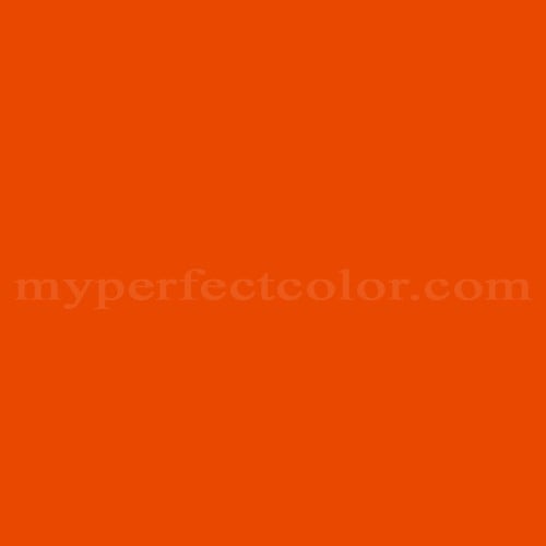
Pantone™ PMS 1665 C
Actual color may vary from on-screen representation. Please view a physical color swatch or material sample to confirm your color choice prior to purchase.
Copy below code in your post

Ready to purchase? Select your options in the 4 steps below.
PMS 1665 C, part of the Pantone PMS collection, is a strong, saturated orange with a distinctly warm character and moderate-to-low light reflectance. This color projects an energetic, assertive, and attention-getting vibe, with visual roles frequently described as bold, dynamic, and visually prominent. It is commonly selected for applications requiring standout color differentiation and quick visual association.
PMS 1665 C exhibits a medium-dark appearance, with an LRV of 21.97 indicating moderate opacity and light reflectance. The color presents a warm hue, leaning toward a vivid, forward orange with a noticeable yellow undertone. Saturation is high, contributing to very strong chromatic intensity and visual impact. The undertone is clearly warm, with a vibrant yellow-orange bias. Highly saturated and vivid nature makes the color finish-sensitive; gloss levels and texture can alter how bright or deep the orange appears.
PMS 1665 C is frequently associated with sports branding, including uniforms and event graphics requiring immediate visibility. The color is widely used in retail environments to signal calls to action or highlight promotional materials. PMS 1665 C appears often in packaging to create shelf standout, especially in food and beverage sectors.
PMS 1665 C works well in brand display, marketing, and signage settings where high visibility and strong color identity are critical. The intense saturation can sometimes challenge coverage, so adequate surface preparation and the use of primer—especially over light or uneven substrates—are recommended. Finish and lighting will affect perceived brightness and depth, and side-by-side with similar oranges, PMS 1665 C will read as more intense and warmer, but can shift in appearance under cool artificial light.
This Pantone PMS color is defined by the Pantone Matching System standard. Evaluate the color using a physical Pantone reference and a real paint sample in the intended lighting and finish. Paint appearance varies by finish and lighting.
- The following examples reflect commonly cited branding associations and are based on publicly referenced design usage; they are illustrative, not exhaustive or exclusive. - PMS 1665 C is widely cited as a key branding color in various collegiate sports programs, especially for team apparel and graphics. - The color is commonly referenced in event marketing literature for use in signage and display to convey energy and call attention.
Similar colors:
PMS 165 C is slightly lighter and less saturated, appearing more neutral and less vivid alongside PMS 1665 C.
PMS 172 C is similar in brightness but distinctly more red, giving it a warmer, less yellow-oriented undertone.
PMS 158 C is somewhat lighter and softer, lacking the bold chromatic intensity of PMS 1665 C.
Product Data
About Pantone and MyPerfectColor
MyPerfectColor is the official licensee of Pantone and authorized to reproduce the Pantone™ PMS 1665 C color in spray paint and other paints.
MyPerfectColor helps marketing professionals turn graphic designs into physical reality. Whether you are a manufacturer, entrepreneur, industrial designer, prototyper/modeler, marketer, agency, printer, retailer, sign manufacturer, exhibit fabricator or architect, MyPerfectColor will help you nail the PMS 1665 C color and produce outstanding results.
MyPerfectColor matches the Pantone PMS 1665 C color based on Pantone color publications. The PMS 1665 C color shown on this website are computer video simulations of the PANTONE PMS 1665 C Color and may not match PANTONE®-identified Color standards. Refer to current PANTONE Publications to obtain accurate color.
The Pantone PMS 1665 C color may vary from the PANTONE Color Standards based on lighting conditions, angle of view and/or due to differences in pigments, manufacturing process, substrate and/or limitations in the color capability of the paint. Refer to current PANTONE Publications to obtain accurate color.
PANTONE® and other Pantone trademarks are the property of Pantone LLC. Portions © Pantone LLC, 2019. Produced under License Agreement between MyPerfectColor.com and Pantone LLC.

Frequently Asked Questions About Pantone™ PMS 1665 C
Why does it matter that PMS 1665 C is reproduced by an authorized source?
PMS 1665 C is defined by Pantone as a licensed color standard, and consistent reproduction is vital for brand-facing applications. MyPerfectColor is authorized to match and reproduce Pantone PMS colors like PMS 1665 C in paint, giving confidence that what you receive aligns with the intended reference. Using an authorized source helps reduce color variation and increases acceptance for visual branding where precise color is critical.
What should I expect when requesting a paint match for PMS 1665 C?
PMS 1665 C is a vivid, saturated orange that can be challenging to match across materials due to its intensity and finish sensitivity. Paint matches may look slightly different depending on gloss, substrate, and lighting. MyPerfectColor specializes in accurate production of PMS 1665 C, but it is still best to confirm results using a physical Pantone reference and a paint sample in the intended conditions. If absolute color alignment is required for critical brand or display work, sampling first is strongly recommended.
How long does it take to produce and ship PMS 1665 C paint?
PMS 1665 C paint is made to order to ensure a correct match. Production lead time depends on the selected product type and current production volume, but most Pantone paint orders are produced and shipped within a few business days. Allow for extra time when ordering large quantities or specialty finishes, and plan ahead if PMS 1665 C is needed for scheduled brand or marketing installations.
What is the best way to prepare a surface for PMS 1665 C paint?
For PMS 1665 C, clean and degrease the surface thoroughly before painting. Lightly scuff or sand glossy or uneven areas to help the paint adhere. Because PMS 1665 C is highly saturated, using a primer can improve uniformity and coverage, especially over contrasting or porous substrates. Always test a small area first in the actual lighting to confirm appearance before full application.
How quickly will I receive my paint matched to Pantone PMS 1665 C?
All paint is custom-made to order. While most orders ship within 48 hours, the lead-time for paint made to match Pantone PMS 1665 C depends on the type of paint needed. Interior and exterior house paints usually ship within 1 to 3 business days, while custom spray paint typically takes 3-5 business days to ship. The transit time depends on your location and the shipping method you choose. If your need is immediate, select Expedited Production during checkout. Most expedited production orders ship within 24 hours on business days. Please contact MyPerfectColor if you are concerned about a specific deadline. We do our best to make sure you get your paint on time. Learn more about paint lead times at MyPerfectColor.
Can I use the Pantone PMS 1665 C for touch up?
Unfortunately, no.
Some manufacturers specify Pantone colors as touch up for their products, but Pantone does not work well as a proxy for a touch-up solution (for a litany of reasons such as it doesn't include sheen and Pantone color tolerances are not tight enough for touch up). When we match Pantone colors we are matching to a swatch in a Pantone book - not to your product.
The only way we can provide a touch-up solution for your product is for you send us a part. We would use the part to create a touch-up grade match. Unfortunately, there isn't an effective way to 'spec' the color well enough to produce a touch up without the part.
Read more about using Pantone for touch-up.
Learn more about our paint color matching service.
How do I buy paint in the Pantone PMS 1665 C?
Many types of paint are available for Pantone PMS 1665 C with no minimum order quantities. MyPerfectColor offers spray paint, paint pens, touch up bottles, water-based acrylics, epoxies, urethanes and a variety of other paints. Select the Paint Type button above to get started. Learn more about buying paint at MyPerfectColor.
How much area will one spray can cover? And what is Pantone PMS 1665 C spray paint made of?
To make spray paint matched to Pantone PMS 1665 C. MyPerfectColor uses an acrylic enamel which is a fast-drying durable coating suitable for interior or exterior use. MyPerfectColor custom spray paint enables you to conveniently achieve a professional spray-smooth finish in any color in any sheen. It sticks well to most surfaces including metal, plastics, powder-coatings, cabinets and primed or previously painted wood.
The 11oz spray will cover about 20 square feet per coat. Keep in mind that it is difficult to gauge how much spray you'll need as it is highly dependent on how it is applied. It is better to have too much than run short.
How do I get the SDS (Safety Data Sheet) for paint matched to Pantone PMS 1665 C?
The Pantone PMS 1665 C is the color and the SDS is based on the type of paint used to make the color. You can find Safety Data Sheets here for our most popular products.
Do I need a primer for Pantone PMS 1665 C?
The need for primer for Pantone PMS 1665 C depends on the type of paint, the substrate being painted and where it will be located. See our Primer Selection Table to see what primer you might need and learn more about when you might need a primer. Most people don't use a primer for a touch up paint application, but a primer may improve adhesion and is typically recommended for exterior applications.
How do I convert PMS 1665 C to a different color from another paint company?
While MyPerfectColor can provide PMS 1665 C in paint, we don't provide any crossover information. We've found that every paint company offers its own unique selection of colors and rarely does a color have an exact equivalent in another company's color collection, especially for a color collection like Pantone which is designed for bright colors and inks.
Color details

LRV: 20.72%
Color properties
Color Type:
Standard
Hide:
Standard
Match Source:
Brochure/swatch book
Match Type:
Physical match
Textured:
No
Source on hand:
Yes
Color Category:
Standard