70% of Orders Ship within 3 Business Days.
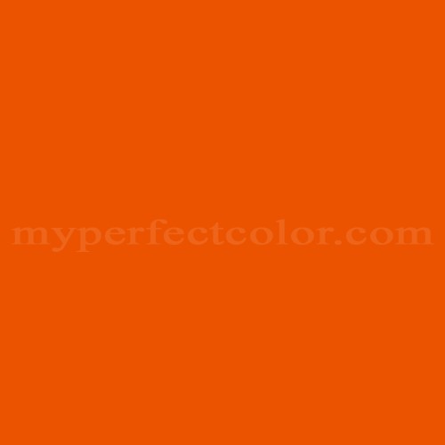
Pantone™ PMS 166 C
Actual color may vary from on-screen representation. Please view a physical color swatch or material sample to confirm your color choice prior to purchase.
Copy below code in your post

Ready to purchase? Select your options in the 4 steps below.
PMS 166 C is part of the Pantone Matching System (PMS) collection, widely referenced for brand, marketing, and display fabrication where highly saturated target colors are required. This color features an assertive, vivid orange appearance with strong chromatic intensity. Its overall vibe is energetic, bold, technical, and attention-grabbing, making it operationally useful where strong visual differentiation is needed.
PMS 166 C presents as a medium-dark color with an LRV of 23.91, indicating moderate light reflectance and substantial saturation. The color is distinctly warm in visual temperature. PMS 166 C is highly saturated, producing a bold, unmistakable intensity. The color shows an orange-red undertone, which can vary in emphasis under different lighting conditions. This color may be sensitive to finish: high-gloss can amplify vibrancy, while matte finishes may slightly mute its boldness. PMS 166 C is less forgiving of surface imperfections due to its vivid chroma.
PMS 166 C is appropriate for projects where attention and brand presence are priorities, such as signage, event displays, and branded environments. It performs well when used as a dominant color or accent in schemes that demand clear visual separation from backgrounds. Careful surface preparation is critical, as its saturation and moderate LRV can highlight flaws or irregularities, particularly in gloss finishes. The perceived vibrancy and undertone of PMS 166 C can shift depending on lighting (warm light will enhance the orange, cool light may make it appear slightly redder). When evaluating its suitability, compare with similar oranges for application-specific context, especially where reflectance or undertone balance is critical.
Similar colors:
PMS 165 C – Slightly lighter and more saturated, producing a more fluorescent effect in some lighting situations.
PMS 172 C – Considerably darker and redder, with a deeper orange-red emphasis.
PMS 158 C – Less saturated and a bit softer, with a slightly paler orange appearance.
Product Data
About Pantone and MyPerfectColor
MyPerfectColor is the official licensee of Pantone and authorized to reproduce the Pantone™ PMS 166 C color in spray paint and other paints.
MyPerfectColor helps marketing professionals turn graphic designs into physical reality. Whether you are a manufacturer, entrepreneur, industrial designer, prototyper/modeler, marketer, agency, printer, retailer, sign manufacturer, exhibit fabricator or architect, MyPerfectColor will help you nail the PMS 166 C color and produce outstanding results.
MyPerfectColor matches the Pantone PMS 166 C color based on Pantone color publications. The PMS 166 C color shown on this website are computer video simulations of the PANTONE PMS 166 C Color and may not match PANTONE®-identified Color standards. Refer to current PANTONE Publications to obtain accurate color.
The Pantone PMS 166 C color may vary from the PANTONE Color Standards based on lighting conditions, angle of view and/or due to differences in pigments, manufacturing process, substrate and/or limitations in the color capability of the paint. Refer to current PANTONE Publications to obtain accurate color.
PANTONE® and other Pantone trademarks are the property of Pantone LLC. Portions © Pantone LLC, 2019. Produced under License Agreement between MyPerfectColor.com and Pantone LLC.

Frequently Asked Questions About Pantone™ PMS 166 C
What are the best practices for reviewing Pantone PMS 166 C samples during brand approval?
To accurately judge Pantone PMS 166 C for brand approval, always compare samples under the same lighting conditions intended for the final installation. Evaluate the color on the same type of surface or material as the final project, since substrate texture and gloss can affect the perceived color. Allow all paint or coatings to fully dry and cure before making final color decisions, as PMS 166 C is a vivid and saturated shade that can appear noticeably different during the wet phase. Taking these steps reduces risk of mismatch and supports consistent brand results.
When is a primer required for Pantone PMS 166 C spray paint or other matched coatings?
The need for primer with Pantone PMS 166 C depends on the substrate (such as metal, plastic, or wood), the paint product type, and the conditions the finished item will face. Primer is important for better adhesion, uniform hide (especially with saturated colors like PMS 166 C), and durability. Bare or porous surfaces, glossy or previously coated substrates, and projects exposed to heavy use will benefit from a proper primer. Refer to surface preparation and primer guidance for your specific material, as skipping primer can lead to uneven color or poor performance.
What should I consider when using Pantone PMS 166 C paint in a pop-up or retail environment?
Pantone PMS 166 C is selected for its visual impact in brand environments, but operational planning matters. Assess the paint durability needs based on expected wear, traffic, and cleaning routines. Before proceeding with a large installation, sample PMS 166 C under the actual lighting to confirm appearance, as saturated oranges are sensitive to both gloss level and light quality. Proper surface prep ensures the color shows true and highlights brand presence as intended.
What are important preparation steps for applying Pantone PMS 166 C to metal or powder-coated parts?
When using Pantone PMS 166 C on metal or already powder-coated items, first clean the surface thoroughly to remove oils and contaminants. For powder-coated or glossy finishes, lightly scuff the surface to improve paint adhesion. Both the base color and gloss can affect how PMS 166 C appears, so evaluate a test area to ensure the result matches expectations. These steps help achieve durable and visually consistent brand results with vivid colors like PMS 166 C.
How quickly will I receive my paint matched to Pantone PMS 166 C?
All paint is custom-made to order. While most orders ship within 48 hours, the lead-time for paint made to match Pantone PMS 166 C depends on the type of paint needed. Interior and exterior house paints usually ship within 1 to 3 business days, while custom spray paint typically takes 3-5 business days to ship. The transit time depends on your location and the shipping method you choose. If your need is immediate, select Expedited Production during checkout. Most expedited production orders ship within 24 hours on business days. Please contact MyPerfectColor if you are concerned about a specific deadline. We do our best to make sure you get your paint on time. Learn more about paint lead times at MyPerfectColor.
Can I use the Pantone PMS 166 C for touch up?
Unfortunately, no.
Some manufacturers specify Pantone colors as touch up for their products, but Pantone does not work well as a proxy for a touch-up solution (for a litany of reasons such as it doesn't include sheen and Pantone color tolerances are not tight enough for touch up). When we match Pantone colors we are matching to a swatch in a Pantone book - not to your product.
The only way we can provide a touch-up solution for your product is for you send us a part. We would use the part to create a touch-up grade match. Unfortunately, there isn't an effective way to 'spec' the color well enough to produce a touch up without the part.
Read more about using Pantone for touch-up.
Learn more about our paint color matching service.
How do I buy paint in the Pantone PMS 166 C?
Many types of paint are available for Pantone PMS 166 C with no minimum order quantities. MyPerfectColor offers spray paint, paint pens, touch up bottles, water-based acrylics, epoxies, urethanes and a variety of other paints. Select the Paint Type button above to get started. Learn more about buying paint at MyPerfectColor.
How much area will one spray can cover? And what is Pantone PMS 166 C spray paint made of?
To make spray paint matched to Pantone PMS 166 C. MyPerfectColor uses an acrylic enamel which is a fast-drying durable coating suitable for interior or exterior use. MyPerfectColor custom spray paint enables you to conveniently achieve a professional spray-smooth finish in any color in any sheen. It sticks well to most surfaces including metal, plastics, powder-coatings, cabinets and primed or previously painted wood.
The 11oz spray will cover about 20 square feet per coat. Keep in mind that it is difficult to gauge how much spray you'll need as it is highly dependent on how it is applied. It is better to have too much than run short.
How do I get the SDS (Safety Data Sheet) for paint matched to Pantone PMS 166 C?
The Pantone PMS 166 C is the color and the SDS is based on the type of paint used to make the color. You can find Safety Data Sheets here for our most popular products.
Do I need a primer for Pantone PMS 166 C?
The need for primer for Pantone PMS 166 C depends on the type of paint, the substrate being painted and where it will be located. See our Primer Selection Table to see what primer you might need and learn more about when you might need a primer. Most people don't use a primer for a touch up paint application, but a primer may improve adhesion and is typically recommended for exterior applications.
How do I convert PMS 166 C to a different color from another paint company?
While MyPerfectColor can provide PMS 166 C in paint, we don't provide any crossover information. We've found that every paint company offers its own unique selection of colors and rarely does a color have an exact equivalent in another company's color collection, especially for a color collection like Pantone which is designed for bright colors and inks.
Color details

LRV: 23.91%
Color properties
Color Type:
Standard
Hide:
Standard
Match Source:
Brochure/swatch book
Match Type:
Physical match
Textured:
No
Source on hand:
Yes
Color Category:
Standard