70% of Orders Ship within 3 Business Days.
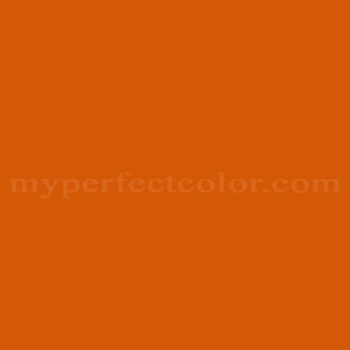
Pantone™ PMS 159 C
Actual color may vary from on-screen representation. Please view a physical color swatch or material sample to confirm your color choice prior to purchase.
Copy below code in your post

Ready to purchase? Select your options in the 4 steps below.
PMS 159 C is part of the Pantone PMS (Pantone Matching System) collection, widely used for consistent color specification across a variety of branded and marketing environments. This color exhibits a vivid, earthy orange with substantial depth and a moderate darkness, giving it a grounded, energetic, and assertive vibe. It is generally interpreted as lively, robust, and attention-grabbing while still conveying a degree of professionalism and stability.
- PMS 159 C has moderate darkness, with a measured LRV of 21.05, making it visibly deeper than brighter oranges. - The color leans warm, based on its qualitative hue position and orange-brown appearance. - This color is highly saturated, contributing to its visual strength and impact. - The undertone reads as an earthy orange, introducing subtle brownish depth not present in more primary or neon oranges. - Finish selection can affect the perceived warmth and brightness, with gloss increasing vibrancy and matte finishes emphasizing the earthy undertone.
PMS 159 C is operationally useful in applications that demand strong visibility and an energetic aesthetic without shifting into aggressive red or yellow zones. It performs well on dimensional signage, exhibit components, and brand collateral where a distinct, memorable orange-brown is required. Users should confirm lighting conditions, as the warmth and darkness will be more pronounced under warmer artificial lights. Due to its saturation, coverage may benefit from careful priming or additional coats, especially over light or highly contrasting substrates. It offers a unique alternative to standard oranges by providing added depth and subtlety.
Similar colors:
PMS 158 C – Slightly lighter and more chromatic, lacking the earthy undertone of PMS 159 C.
PMS 160 C – Darker with a browner base, showing less vivid orange and more subdued earthiness.
PMS 152 C – Warmer and more yellow-leaning, producing a brighter and less robust appearance.
Product Data
About Pantone and MyPerfectColor
MyPerfectColor is the official licensee of Pantone and authorized to reproduce the Pantone™ PMS 159 C color in spray paint and other paints.
MyPerfectColor helps marketing professionals turn graphic designs into physical reality. Whether you are a manufacturer, entrepreneur, industrial designer, prototyper/modeler, marketer, agency, printer, retailer, sign manufacturer, exhibit fabricator or architect, MyPerfectColor will help you nail the PMS 159 C color and produce outstanding results.
MyPerfectColor matches the Pantone PMS 159 C color based on Pantone color publications. The PMS 159 C color shown on this website are computer video simulations of the PANTONE PMS 159 C Color and may not match PANTONE®-identified Color standards. Refer to current PANTONE Publications to obtain accurate color.
The Pantone PMS 159 C color may vary from the PANTONE Color Standards based on lighting conditions, angle of view and/or due to differences in pigments, manufacturing process, substrate and/or limitations in the color capability of the paint. Refer to current PANTONE Publications to obtain accurate color.
PANTONE® and other Pantone trademarks are the property of Pantone LLC. Portions © Pantone LLC, 2019. Produced under License Agreement between MyPerfectColor.com and Pantone LLC.

Frequently Asked Questions About Pantone™ PMS 159 C
How does the finish or sheen affect the appearance of Pantone PMS 159 C in branding and display projects?
The finish you select, such as gloss, satin, or matte, can noticeably change how PMS 159 C looks in real-world use. Gloss finishes make PMS 159 C appear more vibrant and saturated, increasing its visual impact for signage or display. Matte finishes subdue the brightness and can increase the earthy character of this orange-brown, which may appear softer or less intense in certain lighting. Satin offers a middle ground. Always confirm finish choice with stakeholders if exact appearance matters for branding consistency.
What should I consider for coverage when applying PMS 159 C to a new surface?
PMS 159 C is a saturated, moderately deep orange-brown. Like many vivid Pantone colors, it may require more coats to achieve full hide, especially over light or contrasting substrates. For best results and more uniform color, consider using an appropriate primer or a base coat tinted close to PMS 159 C. Planning for at least two coats, or as advised by your paint supplier, helps reduce the risk of patchy appearance and ensures the color reaches its intended saturation and depth.
How does surface texture influence how Pantone PMS 159 C will look on my project?
The surface texture you apply PMS 159 C to will affect its appearance. Smooth substrates tend to make the color appear more consistent and vibrant, while textured or uneven surfaces can scatter light, making PMS 159 C look slightly lighter or duller. Texture may also cause shadowing or change the perceived richness of the color. For critical branding or display work, test PMS 159 C on your actual substrate before committing to large-scale application.
What steps help achieve a uniform appearance for PMS 159 C across large areas?
When applying PMS 159 C over large surfaces, consistency is key. Use the same application method and tools throughout the job, and keep a wet edge to avoid lap marks or differences in sheen. Plan for multiple coats, especially since this saturated color may require them for full, even coverage. Mix all material needed for the project together if possible to ensure color uniformity. Consistency in application technique and coverage helps ensure that PMS 159 C meets brand and visual expectations across all parts of your project.
How quickly will I receive my paint matched to Pantone PMS 159 C?
All paint is custom-made to order. While most orders ship within 48 hours, the lead-time for paint made to match Pantone PMS 159 C depends on the type of paint needed. Interior and exterior house paints usually ship within 1 to 3 business days, while custom spray paint typically takes 3-5 business days to ship. The transit time depends on your location and the shipping method you choose. If your need is immediate, select Expedited Production during checkout. Most expedited production orders ship within 24 hours on business days. Please contact MyPerfectColor if you are concerned about a specific deadline. We do our best to make sure you get your paint on time. Learn more about paint lead times at MyPerfectColor.
Can I use the Pantone PMS 159 C for touch up?
Unfortunately, no.
Some manufacturers specify Pantone colors as touch up for their products, but Pantone does not work well as a proxy for a touch-up solution (for a litany of reasons such as it doesn't include sheen and Pantone color tolerances are not tight enough for touch up). When we match Pantone colors we are matching to a swatch in a Pantone book - not to your product.
The only way we can provide a touch-up solution for your product is for you send us a part. We would use the part to create a touch-up grade match. Unfortunately, there isn't an effective way to 'spec' the color well enough to produce a touch up without the part.
Read more about using Pantone for touch-up.
Learn more about our paint color matching service.
How do I buy paint in the Pantone PMS 159 C?
Many types of paint are available for Pantone PMS 159 C with no minimum order quantities. MyPerfectColor offers spray paint, paint pens, touch up bottles, water-based acrylics, epoxies, urethanes and a variety of other paints. Select the Paint Type button above to get started. Learn more about buying paint at MyPerfectColor.
How much area will one spray can cover? And what is Pantone PMS 159 C spray paint made of?
To make spray paint matched to Pantone PMS 159 C. MyPerfectColor uses an acrylic enamel which is a fast-drying durable coating suitable for interior or exterior use. MyPerfectColor custom spray paint enables you to conveniently achieve a professional spray-smooth finish in any color in any sheen. It sticks well to most surfaces including metal, plastics, powder-coatings, cabinets and primed or previously painted wood.
The 11oz spray will cover about 20 square feet per coat. Keep in mind that it is difficult to gauge how much spray you'll need as it is highly dependent on how it is applied. It is better to have too much than run short.
How do I get the SDS (Safety Data Sheet) for paint matched to Pantone PMS 159 C?
The Pantone PMS 159 C is the color and the SDS is based on the type of paint used to make the color. You can find Safety Data Sheets here for our most popular products.
Do I need a primer for Pantone PMS 159 C?
The need for primer for Pantone PMS 159 C depends on the type of paint, the substrate being painted and where it will be located. See our Primer Selection Table to see what primer you might need and learn more about when you might need a primer. Most people don't use a primer for a touch up paint application, but a primer may improve adhesion and is typically recommended for exterior applications.
How do I convert PMS 159 C to a different color from another paint company?
While MyPerfectColor can provide PMS 159 C in paint, we don't provide any crossover information. We've found that every paint company offers its own unique selection of colors and rarely does a color have an exact equivalent in another company's color collection, especially for a color collection like Pantone which is designed for bright colors and inks.
Color details

LRV: 21.18%
Color properties
Color Type:
Standard
Hide:
Standard
Match Source:
Brochure/swatch book
Match Type:
Physical match
Textured:
No
Source on hand:
Yes
Color Category:
Standard