70% of Orders Ship within 3 Business Days.
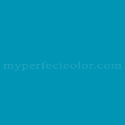
Pantone™ PMS 7459 U
Actual color may vary from on-screen representation. Please view a physical color swatch or material sample to confirm your color choice prior to purchase.
Copy below code in your post

Ready to purchase? Select your options in the 4 steps below.
PMS 7459 U is a Pantone Matching System color commonly specified for brand standards, display elements, and marketing environments. It presents as a calm, technical blue with a slightly muted character, conveying clarity, stability, and contemporary restraint rather than high-energy brightness.
The color has a medium-dark lightness with an LRV of 24.93 and reads cool, positioned in the blue range with a subtle violet lean. It shows moderate saturation, appearing controlled rather than vivid, and carries a clean blue undertone with restrained purple influence.
This color works well in branded displays, signage, and fabricated elements where a composed blue is preferred over brighter corporate blues. As a darker, cooler blue, it can appear deeper under low lighting and slightly flatter in matte finishes, so testing under installed lighting is recommended. When applied over high-contrast or unprimed surfaces, a consistent primer and multiple thin coats can help achieve uniform depth and reduce patchiness.
Similar colors:
PMS 7458 U: slightly lighter and more open, with a clearer blue appearance.
PMS 7460 U: darker and more neutral, with increased visual weight.
Product Data
About Pantone and MyPerfectColor
MyPerfectColor is the official licensee of Pantone and authorized to reproduce the Pantone™ PMS 7459 U color in spray paint and other paints.
MyPerfectColor helps marketing professionals turn graphic designs into physical reality. Whether you are a manufacturer, entrepreneur, industrial designer, prototyper/modeler, marketer, agency, printer, retailer, sign manufacturer, exhibit fabricator or architect, MyPerfectColor will help you nail the PMS 7459 U color and produce outstanding results.
MyPerfectColor matches the Pantone PMS 7459 U color based on Pantone color publications. The PMS 7459 U color shown on this website are computer video simulations of the PANTONE PMS 7459 U Color and may not match PANTONE®-identified Color standards. Refer to current PANTONE Publications to obtain accurate color.
The Pantone PMS 7459 U color may vary from the PANTONE Color Standards based on lighting conditions, angle of view and/or due to differences in pigments, manufacturing process, substrate and/or limitations in the color capability of the paint. Refer to current PANTONE Publications to obtain accurate color.
PANTONE® and other Pantone trademarks are the property of Pantone LLC. Portions © Pantone LLC, 2019. Produced under License Agreement between MyPerfectColor.com and Pantone LLC.

Frequently Asked Questions About Pantone™ PMS 7459 U
How is Pantone PMS 7459 U typically used for sign, display, and exhibit fabrication?
Pantone PMS 7459 U is used as a brand color target when fabricating signs, displays, and exhibit components that must visually align with brand standards. It communicates the intended color appearance, not a specific paint formula or finish.
Because fabricated elements use different substrates and sheens, the best practice is to evaluate a physical sample of PMS 7459 U on the actual material and under the lighting where it will be installed. This helps confirm visual acceptance before full production.
What basic surface preparation is recommended before applying Pantone PMS 7459 U paint?
For Pantone PMS 7459 U paint, start with a clean surface that is free of dust, oils, and residues. Degreasing is important on plastics and metals, while light scuffing may be appropriate on smooth or glossy surfaces to improve adhesion.
Always apply a small test area first. This confirms adhesion, coverage, and appearance on your specific substrate before committing to the full application.
Is Pantone PMS 7459 U suitable for prototypes and concept models?
Yes. Pantone PMS 7459 U is commonly used on prototypes and concept models where visual brand alignment is required. It allows teams to review color appearance early in the design process using a recognized brand reference.
For prototyping, choose a paint format that matches how the model will be built and handled, and plan time to review color appearance on the finished surface. Sampling is especially helpful when materials or lighting may differ from final production.
What should I know before ordering custom-made Pantone PMS 7459 U paint?
Pantone PMS 7459 U paint is custom made to order based on the Pantone reference. Because it is produced specifically for your order, it is important to confirm the product type, sheen, and quantity before ordering.
If your project has strict brand approval requirements or high visibility, ordering a sample first can help reduce risk. Once custom production begins, changes are difficult, so careful planning upfront helps avoid delays or rework.
How quickly will I receive my paint matched to Pantone PMS 7459 U?
All paint is custom-made to order. While most orders ship within 48 hours, the lead-time for paint made to match Pantone PMS 7459 U depends on the type of paint needed. Interior and exterior house paints usually ship within 1 to 3 business days, while custom spray paint typically takes 3-5 business days to ship. The transit time depends on your location and the shipping method you choose. If your need is immediate, select Expedited Production during checkout. Most expedited production orders ship within 24 hours on business days. Please contact MyPerfectColor if you are concerned about a specific deadline. We do our best to make sure you get your paint on time. Learn more about paint lead times at MyPerfectColor.
Can I use the Pantone PMS 7459 U for touch up?
Unfortunately, no.
Some manufacturers specify Pantone colors as touch up for their products, but Pantone does not work well as a proxy for a touch-up solution (for a litany of reasons such as it doesn't include sheen and Pantone color tolerances are not tight enough for touch up). When we match Pantone colors we are matching to a swatch in a Pantone book - not to your product.
The only way we can provide a touch-up solution for your product is for you send us a part. We would use the part to create a touch-up grade match. Unfortunately, there isn't an effective way to 'spec' the color well enough to produce a touch up without the part.
Read more about using Pantone for touch-up.
Learn more about our paint color matching service.
How do I buy paint in the Pantone PMS 7459 U?
Many types of paint are available for Pantone PMS 7459 U with no minimum order quantities. MyPerfectColor offers spray paint, paint pens, touch up bottles, water-based acrylics, epoxies, urethanes and a variety of other paints. Select the Paint Type button above to get started. Learn more about buying paint at MyPerfectColor.
How much area will one spray can cover? And what is Pantone PMS 7459 U spray paint made of?
To make spray paint matched to Pantone PMS 7459 U. MyPerfectColor uses an acrylic enamel which is a fast-drying durable coating suitable for interior or exterior use. MyPerfectColor custom spray paint enables you to conveniently achieve a professional spray-smooth finish in any color in any sheen. It sticks well to most surfaces including metal, plastics, powder-coatings, cabinets and primed or previously painted wood.
The 11oz spray will cover about 20 square feet per coat. Keep in mind that it is difficult to gauge how much spray you'll need as it is highly dependent on how it is applied. It is better to have too much than run short.
How do I get the SDS (Safety Data Sheet) for paint matched to Pantone PMS 7459 U?
The Pantone PMS 7459 U is the color and the SDS is based on the type of paint used to make the color. You can find Safety Data Sheets here for our most popular products.
Do I need a primer for Pantone PMS 7459 U?
The need for primer for Pantone PMS 7459 U depends on the type of paint, the substrate being painted and where it will be located. See our Primer Selection Table to see what primer you might need and learn more about when you might need a primer. Most people don't use a primer for a touch up paint application, but a primer may improve adhesion and is typically recommended for exterior applications.
How do I convert PMS 7459 U to a different color from another paint company?
While MyPerfectColor can provide PMS 7459 U in paint, we don't provide any crossover information. We've found that every paint company offers its own unique selection of colors and rarely does a color have an exact equivalent in another company's color collection, especially for a color collection like Pantone which is designed for bright colors and inks.
Color details

LRV: 24.93%
Color properties
Color Type:
Standard
Hide:
Standard
Match Source:
Brochure/swatch book
Match Type:
Physical match
Textured:
No
Source on hand:
Yes
Color Category:
Standard