70% of Orders Ship within 3 Business Days.
Pantone™ PMS 542 C
Actual color may vary from on-screen representation. Please view a physical color swatch or material sample to confirm your color choice prior to purchase.
Copy below code in your post

Ready to purchase? Select your options in the 4 steps below.
PMS 542 C is a standardized blue from the Pantone PMS collection, often perceived as clean, stable, understated, and approachable. Its overall vibe is professional, subdued, and contemporary, making it suitable for situations where a blue is needed to convey trust without being overly bold. The Pantone Matching System standard ensures that this color may be communicated and reproduced consistently across multiple materials for marketing, display, and identity applications.
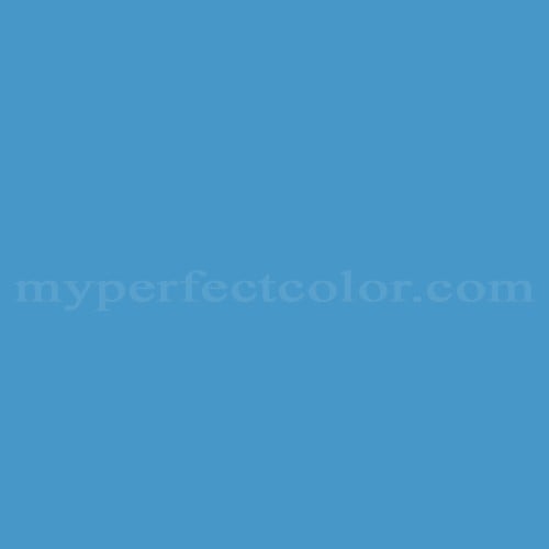
PMS 542 C appears as a light to mid-tone blue. The color displays a predominantly cool temperature. PMS 542 C maintains moderate saturation, creating a soft and somewhat powdery effect. The undertone is neutral-cool, with minimal visible green or violet influences. PMS 542 C has a Light Reflectance Value (LRV) of 28.12, contributing to its light yet muted visual presence. The color is not highly sensitive to finish, but gloss or matte applications may subtly affect its apparent depth and cleanliness.
PMS 542 C works well in applications where a recognizable yet understated blue is required for brand consistency, environments, or displays. Users should evaluate the color under intended lighting conditions, as cooler blues can shift appearance depending on ambient light temperature and surrounding color context. Compared to other blues in the Pantone system, PMS 542 C is softer and less chromatic, offering a more calming, less assertive effect. For best results, confirm visual alignment with a physical Pantone reference and a painted sample in the selected finish.
This Pantone PMS color is defined by the Pantone Matching System standard. Evaluate the color using a physical Pantone reference and a real paint sample in the intended lighting and finish. Paint appearance varies by finish and lighting.
- The following examples reflect commonly cited branding associations and are based on publicly referenced design usage; they are illustrative, not exhaustive or exclusive. - PMS 542 C is widely cited as a signature blue in higher education branding materials, including use by the University of North Carolina at Chapel Hill for institutional identity. - PMS 542 C is frequently referenced in sports team identity systems, including university and minor league teams, where a soft blue is part of the official palette.
Similar colors:
PMS 543 C: Lighter and airier, offering a paler, more pastel blue appearance.
PMS 544 C: Slightly lighter and cooler, presenting a crisper and less saturated blue.
PMS 292 C: More chromatic and vivid, resulting in a bolder and brighter blue compared to the muted PMS 542 C.
Product Data
About Pantone and MyPerfectColor
MyPerfectColor is the official licensee of Pantone and authorized to reproduce the Pantone™ PMS 542 C color in spray paint and other paints.
MyPerfectColor helps marketing professionals turn graphic designs into physical reality. Whether you are a manufacturer, entrepreneur, industrial designer, prototyper/modeler, marketer, agency, printer, retailer, sign manufacturer, exhibit fabricator or architect, MyPerfectColor will help you nail the PMS 542 C color and produce outstanding results.
MyPerfectColor matches the Pantone PMS 542 C color based on Pantone color publications. The PMS 542 C color shown on this website are computer video simulations of the PANTONE PMS 542 C Color and may not match PANTONE®-identified Color standards. Refer to current PANTONE Publications to obtain accurate color.
The Pantone PMS 542 C color may vary from the PANTONE Color Standards based on lighting conditions, angle of view and/or due to differences in pigments, manufacturing process, substrate and/or limitations in the color capability of the paint. Refer to current PANTONE Publications to obtain accurate color.
PANTONE® and other Pantone trademarks are the property of Pantone LLC. Portions © Pantone LLC, 2019. Produced under License Agreement between MyPerfectColor.com and Pantone LLC.

Frequently Asked Questions About Pantone™ PMS 542 C
Are there any notable brands or institutions that use Pantone PMS 542 C as part of their official color palette?
Yes, Pantone PMS 542 C is widely cited as the signature blue used by the University of North Carolina at Chapel Hill in its institutional identity. This color is also referenced in other higher education and sports team branding systems, where a soft blue is needed for a distinctive and recognizable palette. If you are aiming for alignment with known brand standards, verifying your project against a physical Pantone reference and a sample in the intended finish is recommended for PMS 542 C.
What surface preparation steps should I follow before applying paint matched to PMS 542 C?
To achieve accurate, brand-consistent results with Pantone PMS 542 C, start by ensuring all surfaces are clean, dry, and free of dust or oils. Degrease any glossy or previously coated areas and lightly scuff glossy surfaces for better adhesion. For best results, test a small area in the intended finish before proceeding with the full project. Proper preparation helps your PMS 542 C color appear as intended and last longer on displays or branding components.
How much coverage should I expect from a spray can of PMS 542 C paint, and how can I estimate my project needs?
A standard spray can of Pantone PMS 542 C typically covers about 20 to 25 square feet per coat on a smooth, primed surface. Actual coverage varies based on surface texture, color contrast, number of coats, and application technique. For brand and display applications, plan for at least two coats to achieve uniform color. It is best to calculate total square footage, add extra for test sprays and overlap, and consider ordering additional cans for large or complex installations.
What safety and VOC considerations should I be aware of when using paint matched to Pantone PMS 542 C?
Safety requirements for Pantone PMS 542 C paint depend on the specific product type and format you select. Always review the Safety Data Sheet (SDS) for detailed handling and ventilation guidance. Use all paints in well-ventilated areas, avoid skin and eye contact, and wear appropriate protective gear as indicated on the product label. VOC content and emissions can vary by product, so confirm compliance if you have specific regulatory or workplace requirements.
How quickly will I receive my paint matched to Pantone PMS 542 C?
All paint is custom-made to order. While most orders ship within 48 hours, the lead-time for paint made to match Pantone PMS 542 C depends on the type of paint needed. Interior and exterior house paints usually ship within 1 to 3 business days, while custom spray paint typically takes 3-5 business days to ship. The transit time depends on your location and the shipping method you choose. If your need is immediate, select Expedited Production during checkout. Most expedited production orders ship within 24 hours on business days. Please contact MyPerfectColor if you are concerned about a specific deadline. We do our best to make sure you get your paint on time. Learn more about paint lead times at MyPerfectColor.
Can I use the Pantone PMS 542 C for touch up?
Unfortunately, no.
Some manufacturers specify Pantone colors as touch up for their products, but Pantone does not work well as a proxy for a touch-up solution (for a litany of reasons such as it doesn't include sheen and Pantone color tolerances are not tight enough for touch up). When we match Pantone colors we are matching to a swatch in a Pantone book - not to your product.
The only way we can provide a touch-up solution for your product is for you send us a part. We would use the part to create a touch-up grade match. Unfortunately, there isn't an effective way to 'spec' the color well enough to produce a touch up without the part.
Read more about using Pantone for touch-up.
Learn more about our paint color matching service.
How do I buy paint in the Pantone PMS 542 C?
Many types of paint are available for Pantone PMS 542 C with no minimum order quantities. MyPerfectColor offers spray paint, paint pens, touch up bottles, water-based acrylics, epoxies, urethanes and a variety of other paints. Select the Paint Type button above to get started. Learn more about buying paint at MyPerfectColor.
How much area will one spray can cover? And what is Pantone PMS 542 C spray paint made of?
To make spray paint matched to Pantone PMS 542 C. MyPerfectColor uses an acrylic enamel which is a fast-drying durable coating suitable for interior or exterior use. MyPerfectColor custom spray paint enables you to conveniently achieve a professional spray-smooth finish in any color in any sheen. It sticks well to most surfaces including metal, plastics, powder-coatings, cabinets and primed or previously painted wood.
The 11oz spray will cover about 20 square feet per coat. Keep in mind that it is difficult to gauge how much spray you'll need as it is highly dependent on how it is applied. It is better to have too much than run short.
How do I get the SDS (Safety Data Sheet) for paint matched to Pantone PMS 542 C?
The Pantone PMS 542 C is the color and the SDS is based on the type of paint used to make the color. You can find Safety Data Sheets here for our most popular products.
Do I need a primer for Pantone PMS 542 C?
The need for primer for Pantone PMS 542 C depends on the type of paint, the substrate being painted and where it will be located. See our Primer Selection Table to see what primer you might need and learn more about when you might need a primer. Most people don't use a primer for a touch up paint application, but a primer may improve adhesion and is typically recommended for exterior applications.
How do I convert PMS 542 C to a different color from another paint company?
While MyPerfectColor can provide PMS 542 C in paint, we don't provide any crossover information. We've found that every paint company offers its own unique selection of colors and rarely does a color have an exact equivalent in another company's color collection, especially for a color collection like Pantone which is designed for bright colors and inks.
Color details

LRV: 41.36%
Color properties
Color Type:
Standard
Hide:
Standard
Match Source:
Brochure/swatch book
Match Type:
Physical match
Textured:
No
Source on hand:
Yes
Color Category:
Standard