How Can a Color Both Match and NOT Match?
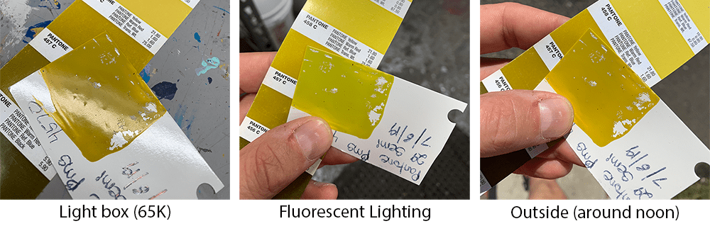
How can a color simultaneously match and not match? A color either matches or it doesn't, right? How can colors look different under different light sources? Color is light reflection, so when the light source changes, so does the color. I was at a campout this past weekend and we had a big basket of shiny freshly-picked bright red apples, but at night under the red light from my head lamp, they looked like white apples. If I had a green light they probably would have looked brown. Most of the time we don't notice how different the various light sources we use really are. In our facility we have cool white fluorescent in our office and big picture windows, daylight-temperature bulbs throughout the plant, daylight-cailbrated bulbs in our lightboxes and some LED lights. If you walk around the plant with a color chip it "changes" from room to room.
If this isn't complicated enough, different colors are affected differently by light. Metamerism occurs when two colors match under some light sources and don't match under others. This is because the components used to make the colors have different spectral curves. If the colors are made using the same exact pigments, then the resulting colors should have the same shaped curves and there wouldn't be metamerism. But this usually isn't possible. One of the objects may have been made with inks or dyes while the other is made with pigments. The ingredients may look the same but if you compared them across the whole light spectrum you would see them diverge at various points.
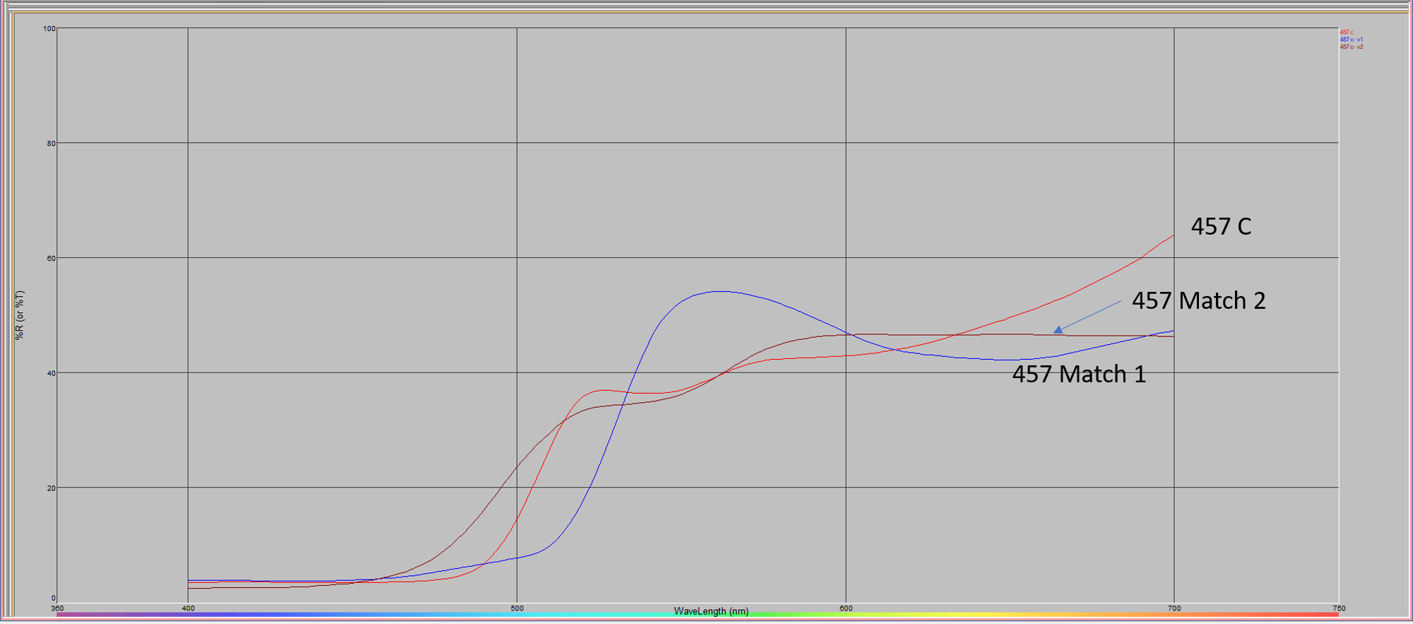
This graph shows the spectral curves of the three different colors. The original Pantone 457 C and our matches 1 & 2. The spectral curve shows a color's reflectance at each light wavelength from 400 to 700 nm (nanometers). You can see from the curves that our Match 1 is close in a couple spots but diverges widely in others. Match 2 much more closely matches the curve of the original and will be a good match under most lighting conditions. Match 1 is highly metameric and Match 2 isn't. We used different pigments to create Match 2 which more closely aligned with the inks Pantone used to create their color book.
Why is it important to understand this? You may compare color chips in an office and determine that a particular Pantone color matches, but it could be that it is only a good match for that particular lighting source. Understanding how light affects color can help you better evaluate matches and manage your quality processes.
Do you have questions about getting an exact color match -- if so, contact us or learn more about our Custom Color Matching Services.